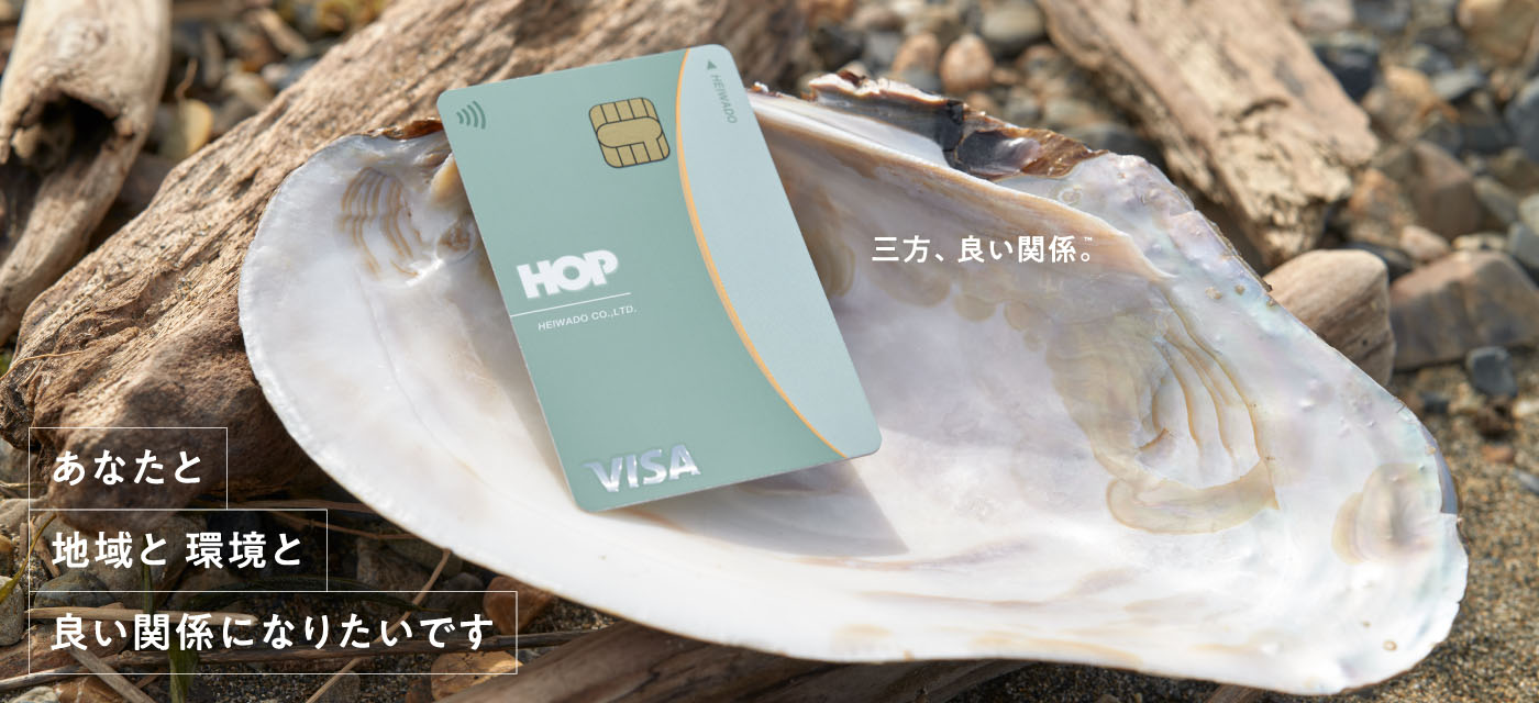
HOP-VISAカード
1957年彦根市に開業して以来、滋賀県内を中心に総合スーパー、スーパーマーケット事業を広く展開する平和堂。県民のカード所有率の高さでも知られる同社の電子マネー事業におけるフラッグシップは、クレジットカード機能等を備えたHOP-VISAカード。そのリニューアルにあたり、既に県内のデザイナーによりデザインされた新しいカードも包括するHOP-VISAカードビジネス全体のコンセプト設計および初期ブランディングをo-lab inc.が手がけました。
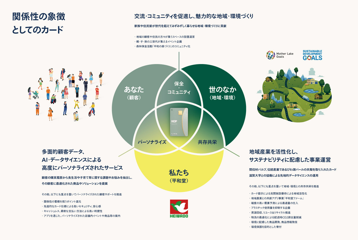
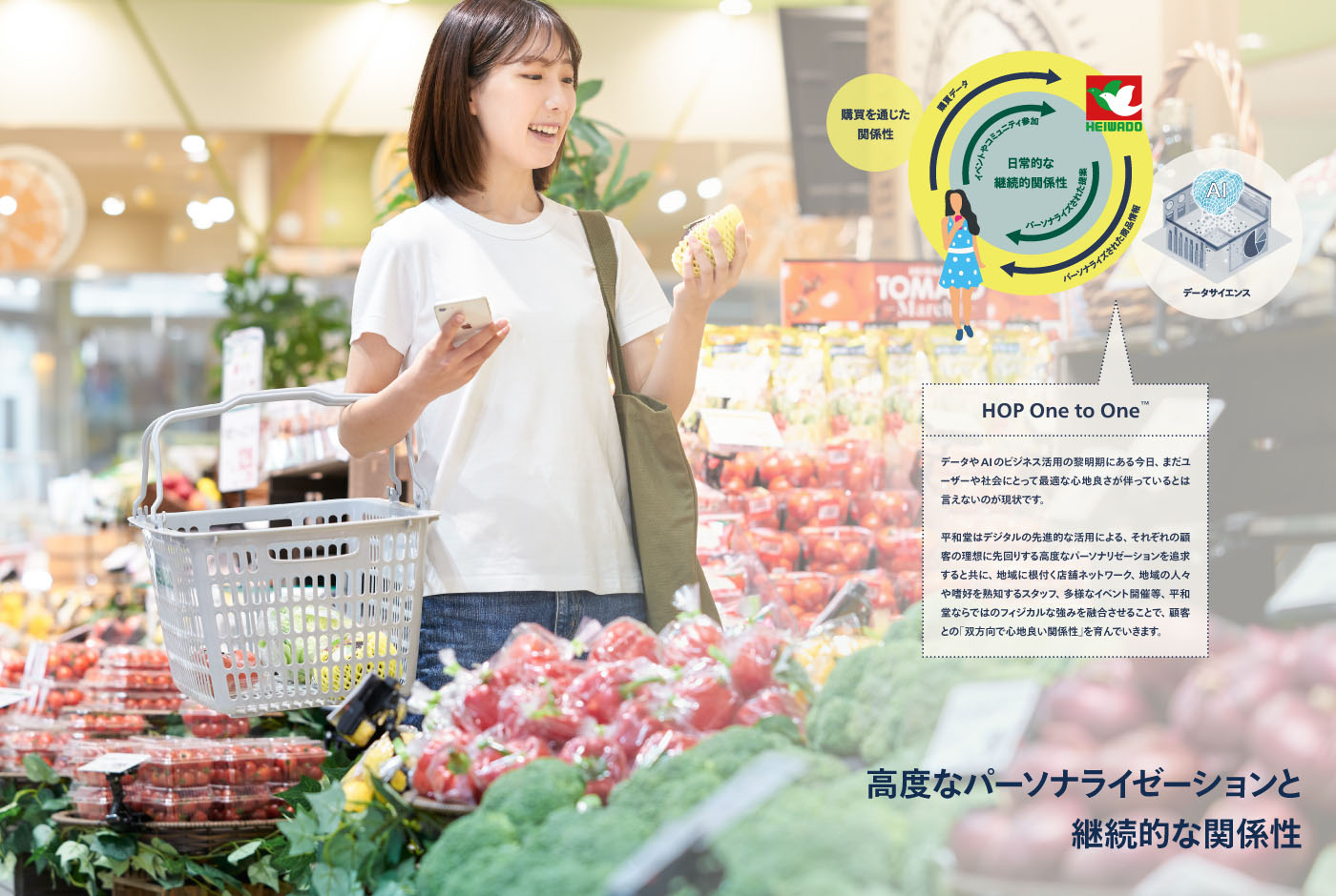
県内間伐材由来のパルプをカード基材に約10%使用。地場産業であるびわ湖パールの製造工程で破棄される貝殻をインクに配合した特殊印刷。日本で初めてデータサイエンス学部を開設した滋賀大学との協働によるサービスの高度なパーソナライゼーション。今回のリニューアルにおいて訴求したい要素に溢れる中、サステナビリティへの配慮や先端的データサイエンス・AIの活用等を、そもそも平和堂がなぜ行うのか?という問いに対する社内的および社外的に共感性の高い答えを見つけることがo-labのミッションでした。
平和堂の歴史を掘り下げる中で、また未来の同社の姿を議論する中で浮き彫りになった、新しい近江商人のかたちを追求したいという思い。「三方良し」の進化系は関係性という概念の導入により描けると確信したo-labは、「三方、良い関係。」というコンセプトを提案しました。それは、売り手・買い手・世間それぞれにとっての良い状態を定義するのではなく、全てはそれらの間の良質な関係性構築が最重要であり、その結果として自然と全体が良くなる、という動的かつ心地良い相互依存の姿。また、従来の「世間」は「地域と環境」と再解釈することで、ブランドとして思いを巡らせる対象が平和堂にとって、またお客さまにとってより明確となりました。
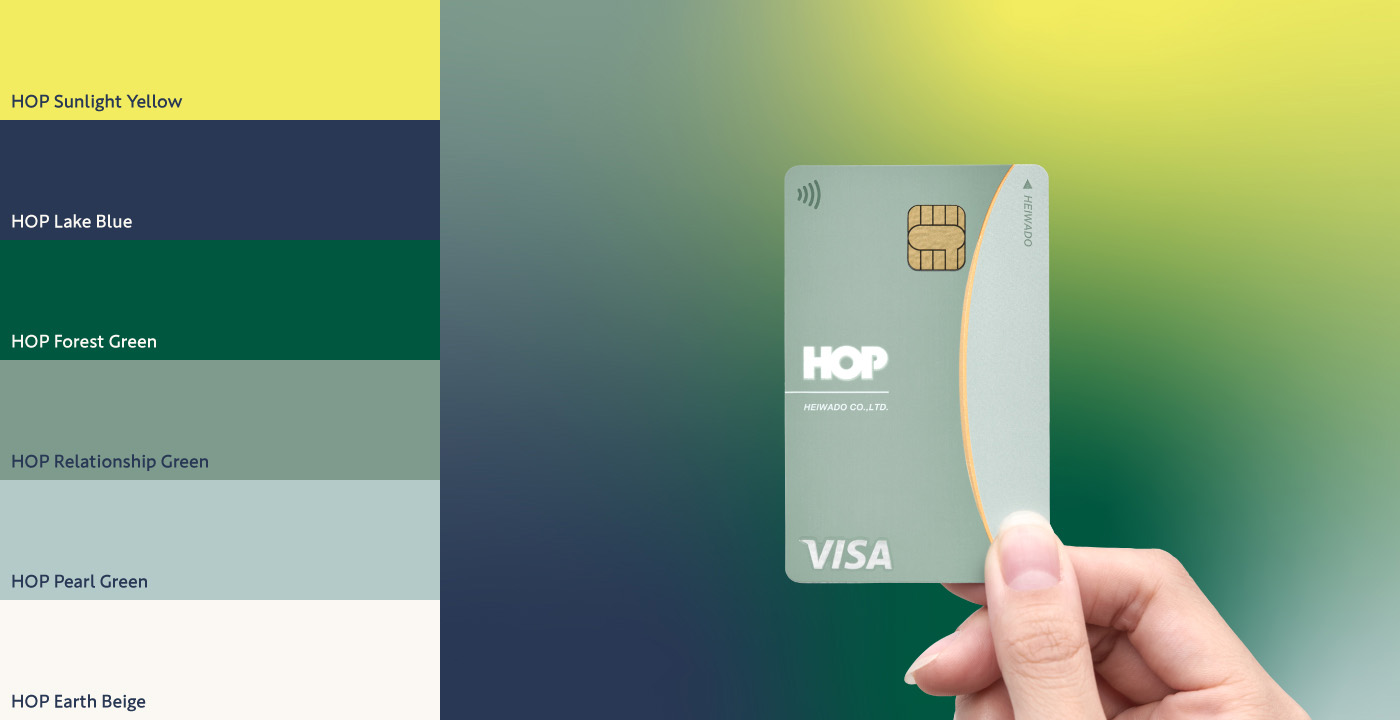
カードデザインから抽出したHOP Relationship Green、HOP Pearl Greenに、琵琶湖や滋賀の豊かな自然や未来志向を感じさせるHOP Lake Blue、HOP Forest Green、HOP Sunlight Yellowを加えたブランドカラーにより、ソフトな関係性、洗練、垢抜けた印象が共存する世界観を設計しました。
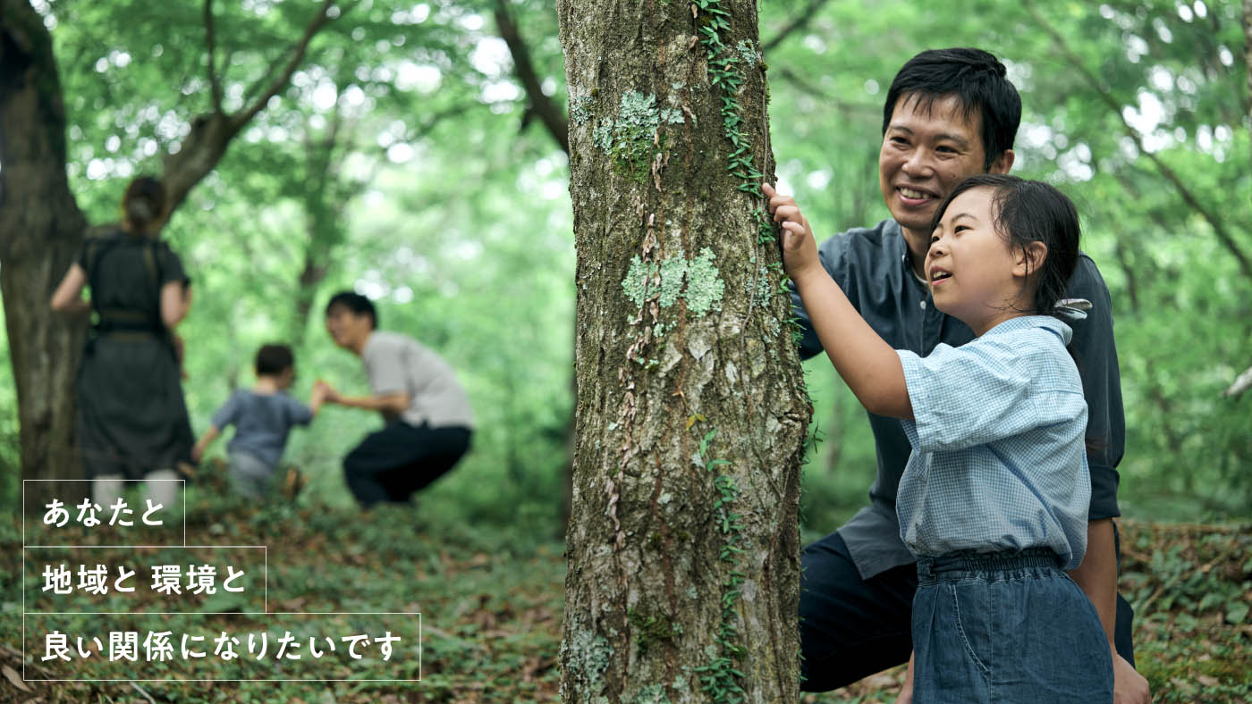
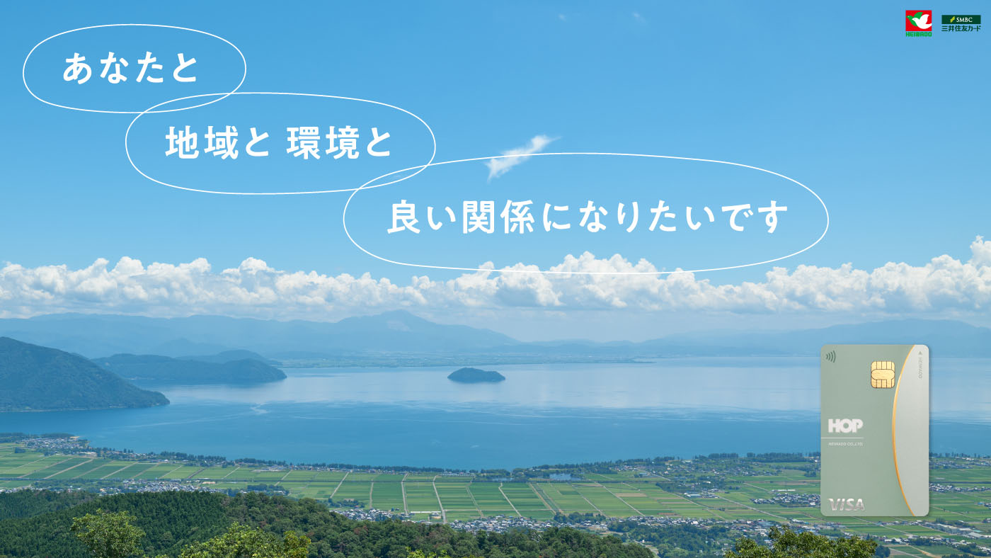
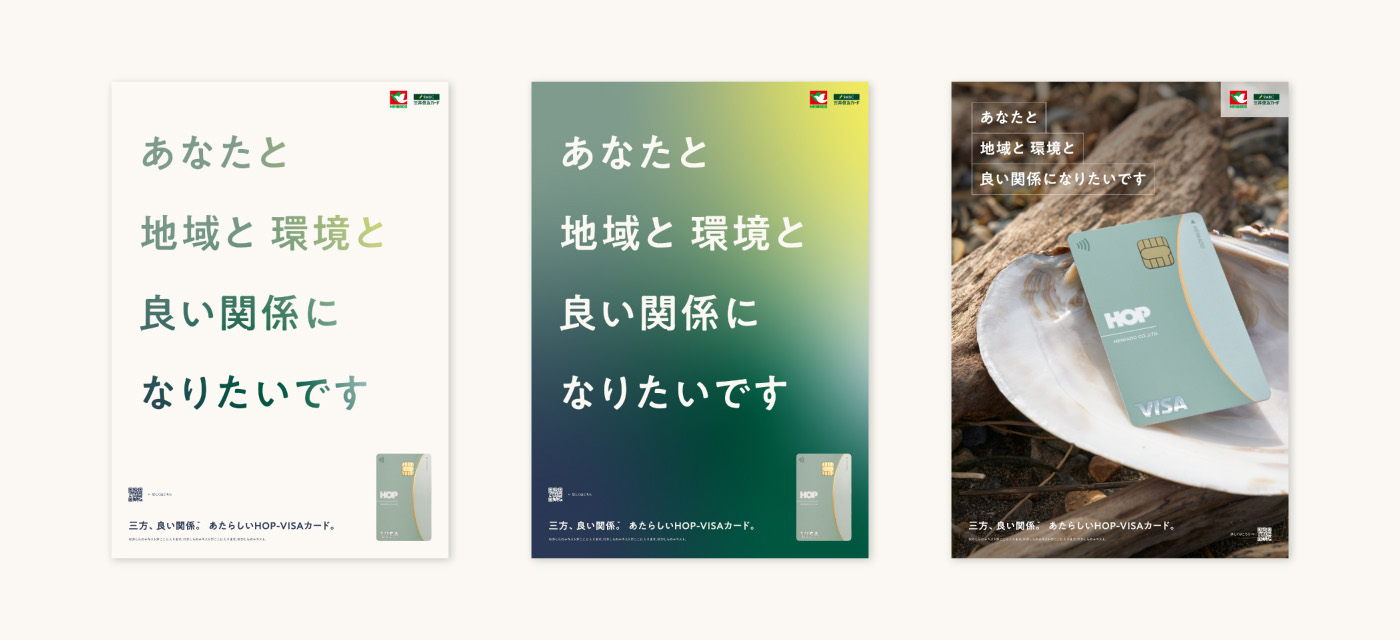
HOP-VISAカードのタグラインとなった「三方、良い関係。」は「あなたと 地域と環境と 良い関係になりたいです。」と優しく語るブランドメッセージと共にポスター等印刷物やウェブのキーグラフィックスに昇華され、あたらしいHOP-VISAカードのデビューを飾りました。
Since its establishment in 1957 in Hikone City, Heiwado has been widely expanding its general supermarket and superstore businesses primarily in Shiga Prefecture. The flagship in their electronic money business, known for its high card ownership rate among prefectural residents, is the HOP-VISA card, equipped with credit card features, among others. o-lab inc. was responsible for the overall concept for the whole HOP-VISA card business, that encompasses the new card design by a local designer based in Shiga, as well as the initial branding.
Approximately 10% of the card substrate is made from locally sourced thinned wood pulp. Special printing incorporates discarded shells from the production process of Lake Biwa pearls, a local industry, into the ink. Advanced personalization of services through collaboration with Shiga University, which was the first in Japan to establish a data science department. Amidst the abundance of elements to convey in this renewal, o-lab’s mission was to find answers, both internally and externally, that resonated with why Heiwado does what it does, considering sustainability and the use of cutting-edge data science and AI, among others.
As o-lab and Heiwado delved into the history of the company and discussed the company’s future, the desire to pursue the image of a new Omi merchant – a historical mercantile tradition of the region – became evident. Being convinced that an evolution of “win-win-win” could be drawn by introducing the concept of relationships, o-lab proposed the concept of 三方、良い関係, which translates to “Good Relationships between All Parties.” This concept emphasizes that, rather than defining what is good for sellers, buyers, and society individually, the most crucial aspect is building rich and deep relationships between them, resulting in a dynamic and mutually beneficial interdependence. Additionally, by reinterpreting “society” as “locality and environment,” the brand’s focus for Heiwado and its customers became clearer.
The new brand’s colors consist of hues derived from the card design such as HOP Relationship Green, HOP Pearl Green, and newly defined colors such as HOP Lake Blue, HOP Forest Green, and HOP Sunlight Yellow. The palette as a whole evokes a world where soft relationships, sophistication, and refined impressions coexist.
The tagline for the HOP-VISA card, 三方、良い関係. (“Good Relationships between All Parties.”), is accompanied by a brand message that expresses a desire to build and maintain a good relationship between Heiwado, the customer, and the community/environment. This message is integrated into posters, printed materials, and web key graphics, heralding the debut of the new HOP-VISA card.
Client
平和堂|Heiwado
Year
2023
Award
Good Design Award (2023)
Photography: Mariko Taya (Qualite Link)