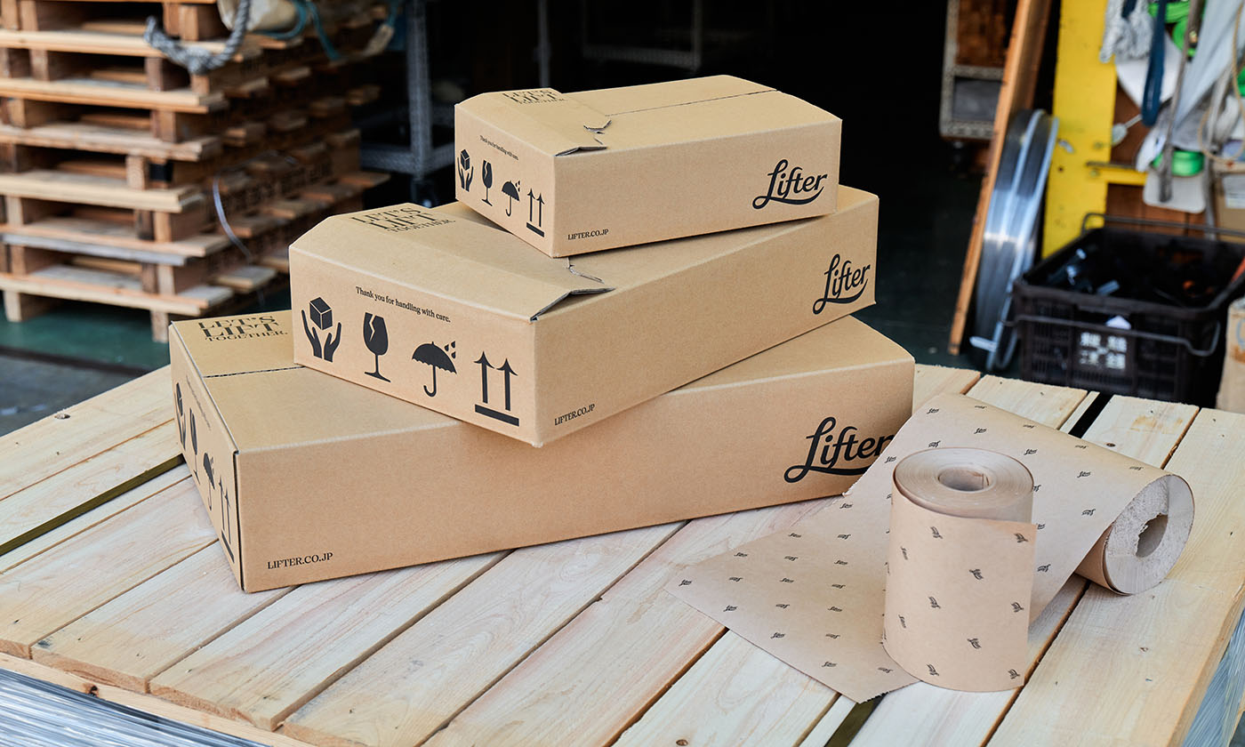
リフター
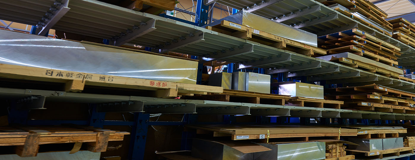

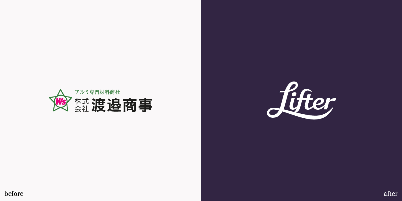
京都のアルミニウム素材商社、株式会社渡邉商事の経営体制の刷新にあたり、社名の変更を始めとする抜本的なリブランディングをo-lab inc.が伴走支援しています。
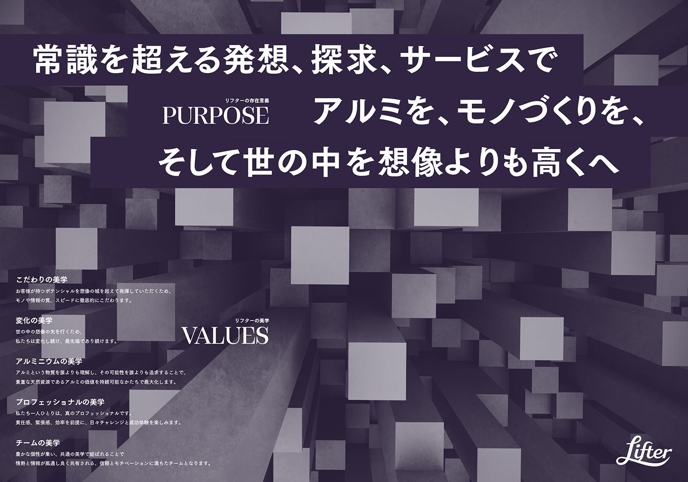
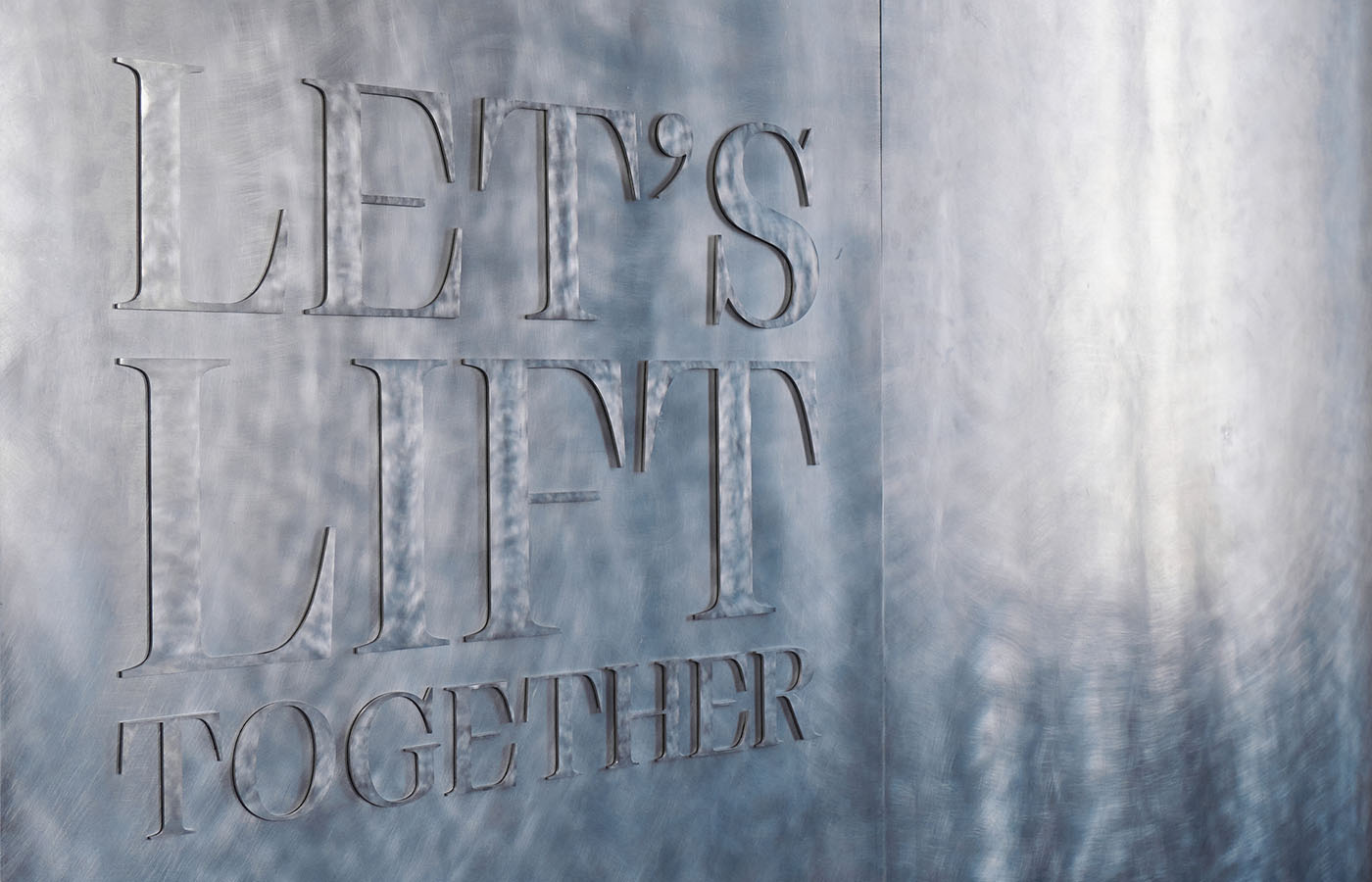
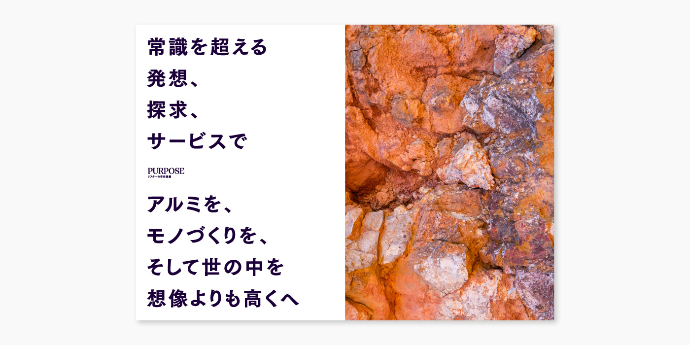
最初に着手したのは、経営理念を社員が自分ゴトとして誇りに感じ、社内外で語れるものとして再構築することでした。社員アンケートや経営陣とのワークショップ、度重なる対話を通して抽出された同社のDNAは、顧客の使用目的に適合した寸法精度を保証する「ゼロカット」シリーズに代表される、それまでになかったサービスを先駆的に打ち出し続けること。そこから拡張した「想像よりも高くへと持ち上げる」という概念を軸として据えれば、アルミの可能性、金属素材商社による顧客サービス、モノづくり企業ができること、の全てに通じ、かつ同社の社会的存在意義となり得ると考えたo-lab inc.は、その前提が常識を超える発想、探求であるとした新たなパーパス、そして新社名「リフター」を提案しました。さらに、水谷社長が経営において重要視されている美しさと親和性の高い「美学」として価値観・行動基準を対話を重ねながら策定していきました。
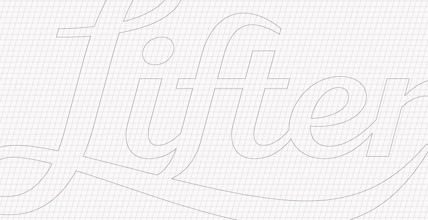
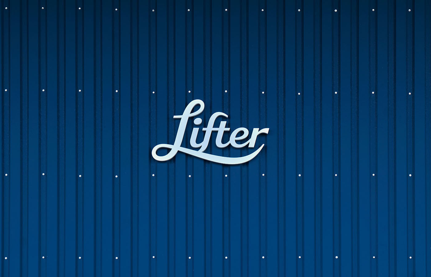
ダイナミズムと洗練、クラシックと現代性、感性とロジックが共存するロゴ。想像を超える高さまで到達し宇宙的な紫味を帯びるLifter Limitless Blue。業界としては異例のトーン&マナーは、先入観を排除した上で会社としての美学を追求した結果です。新しい経営理念はボーキサイト鉱物自体やアルミの削り屑にさえ美しさと愛着を感じさせ始めるもので、これからの同業界の姿を先取りしたものと自負しています。また、リフター社内におけるモチベーションと求心力、そして社外からの期待値の高まりという大きな手応えを感じておられます。
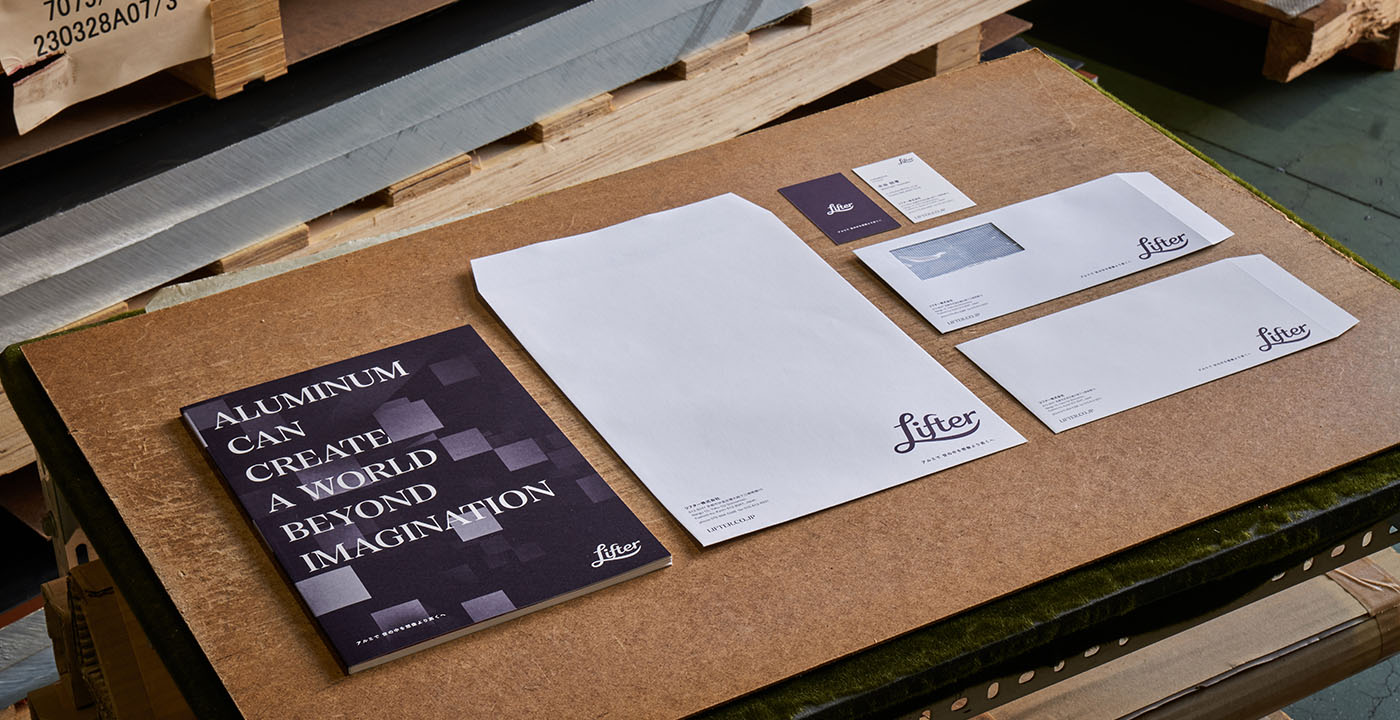
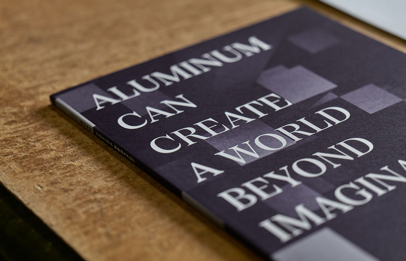
現在、カタログの刷新やウェブサイトのリニューアルなどが完了しています。これからも一歩一歩、着実に続いていくリフターのリブランディングにご期待ください。
Watanabe Trading Co., Ltd. an aluminum material trading company in Kyoto, has undergone a major change of management structure, and o-lab inc. has been supporting the ongoing rebranding process, including a change of company name.
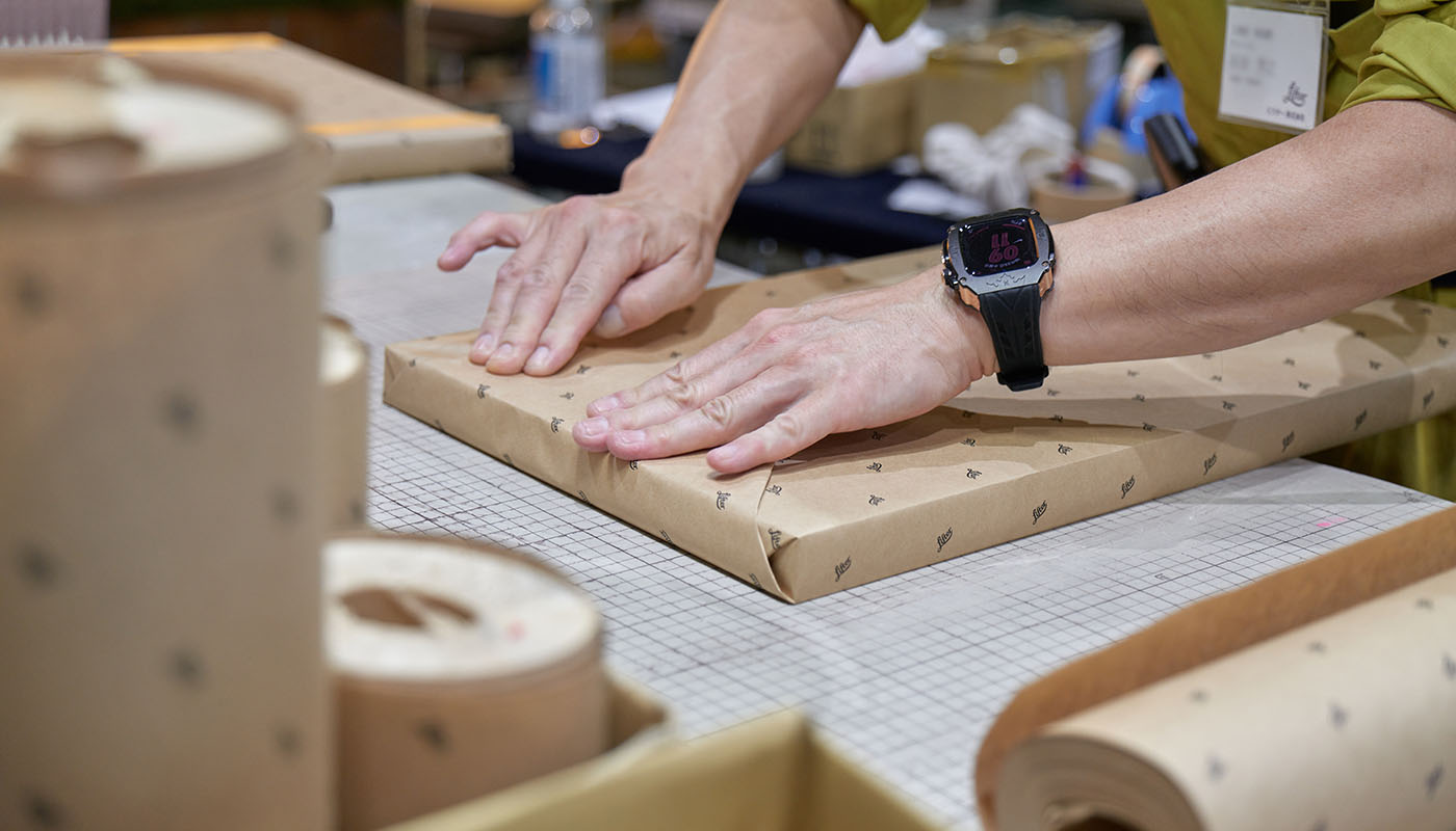
The first step was to reconstruct the company’s management philosophy into something that employees could take pride in and talk about, both inside and outside the company. Through employee surveys, workshops with management, and repeated dialogues, the DNA of the company was identified as follows: to pioneer services that were previously unavailable, represented by the “Zero Cut” series that guarantees dimensional accuracy suitable for the customer’s purpose.
Based on this, o-lab inc. proposed a new concept centered around the idea of “lifting higher than imagined”, which encompasses the potential of aluminum, customer service by metal material trading companies, and what manufacturing companies can do. This concept, which goes beyond conventional thinking and exploration, led to the proposal of a new purpose and the new company name: Lifter. In addition, through repeated dialogues, we identified several values and behavioral standards as “aesthetics” that company president Mr. Mizutani values in management.
The logo embodies dynamism and refinement, the classic and modern, sensibility, and logic. The Lifter Limitless Blue, which reaches heights beyond imagination and has a cosmic purple hue, is an unprecedented tone and manner for the industry, resulting from pursuing the company’s aesthetics without preconceptions. The new management philosophy begins to evoke beauty and attachment even in bauxite minerals and aluminum shavings, and is proud to be ahead of its time in the industry. Lifter also feels a strong response in terms of motivation and cohesion from within, as well as increased expectations from outside the company.
Client
リフター(旧 渡邉商事)
Year
2022
Photography: Mariko Taya (Qualite Link)