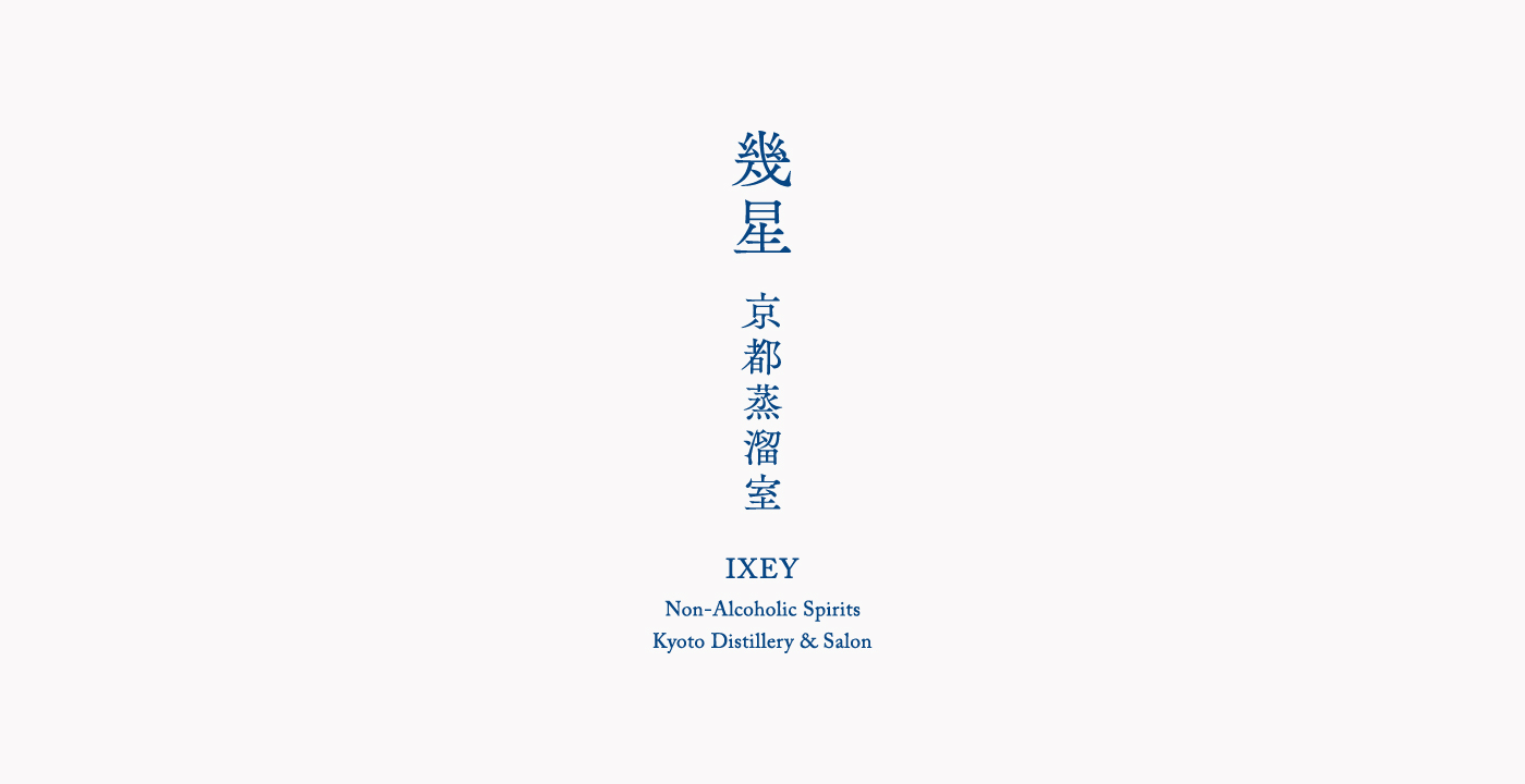
幾星 京都蒸溜室|miatina
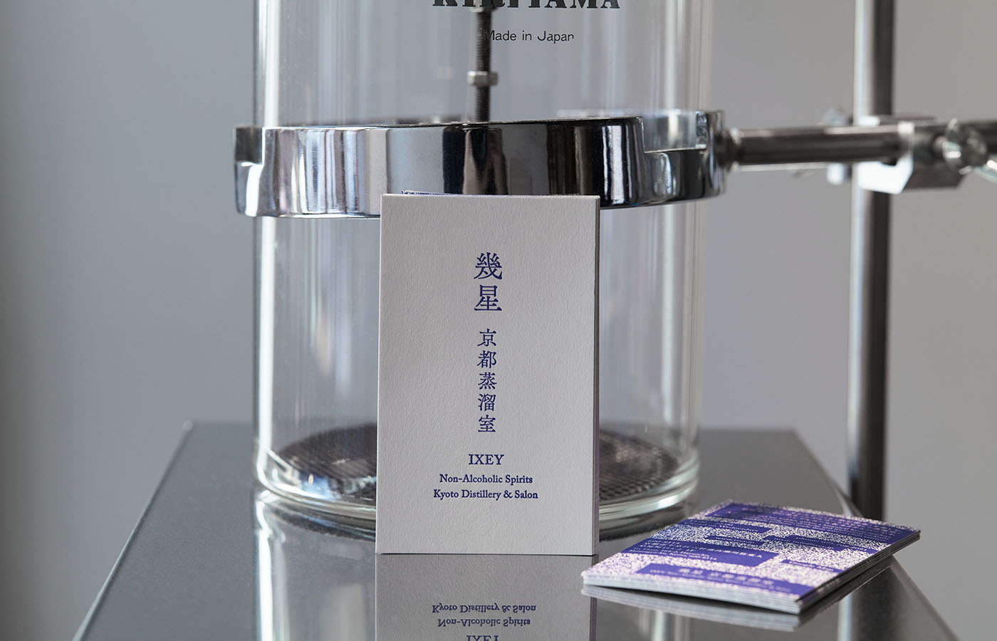
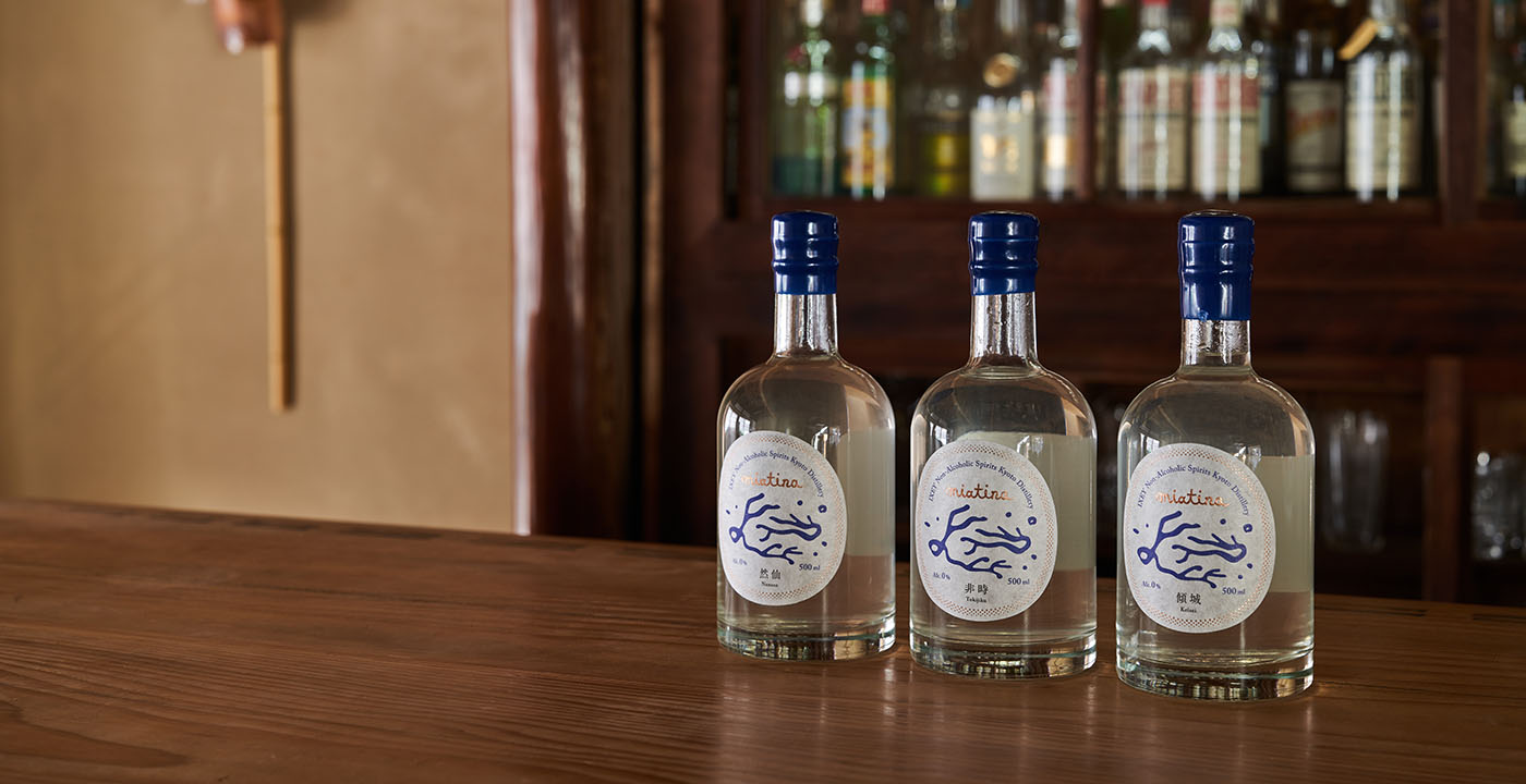
ソバーキュリアスの機運も高まる中、京都・祇園のバー「喫酒 幾星」のオーナー兼バーテンダー織田浩彰氏が京都市五条菊浜エリアに新たにオープンした、ノンアルコールスピリッツ蒸溜所を併設するバー「幾星 京都蒸溜室」。店舗ロゴ、ショップカードデザイン、そして同蒸溜室によるオリジナルノンアルコールスピリッツブランドのネーミング、ロゴ、ラベル、パッケージデザインをo-lab inc.が手がけました。
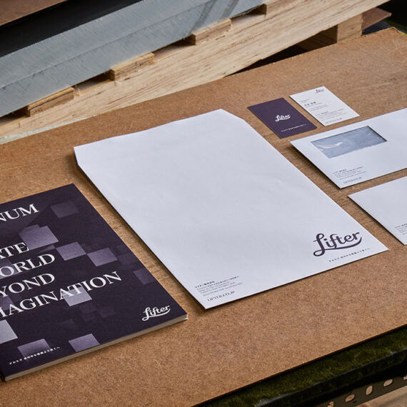
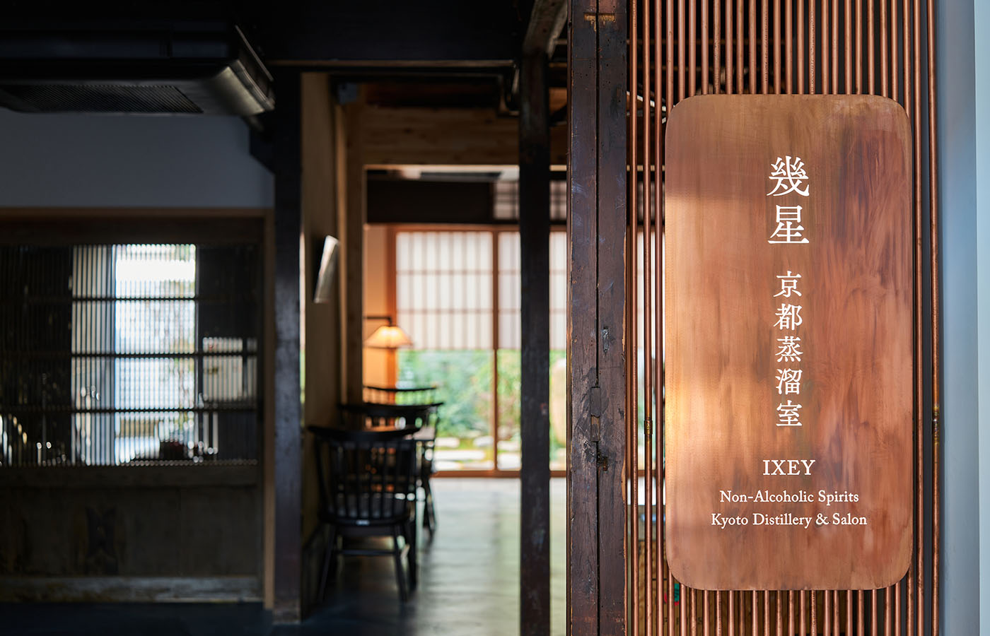
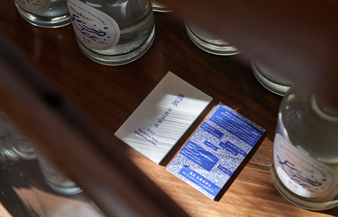
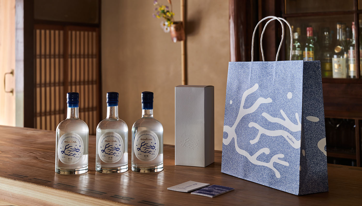
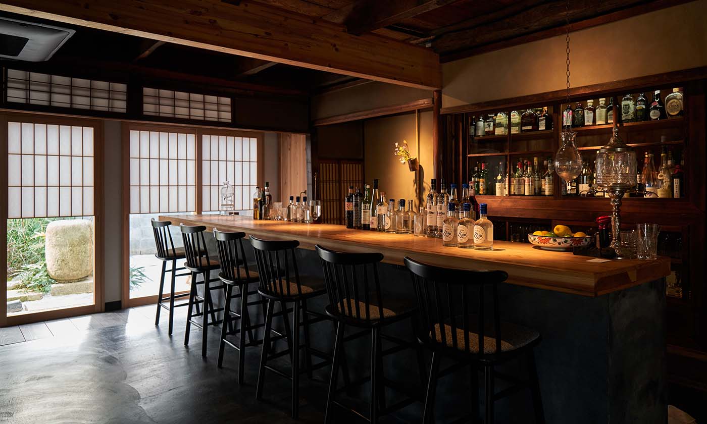
銅板製の看板内で柔らかく灯る蒸溜所ロゴが、築140年ほどの京町家を改装した、初めて訪れた時から何とも言えぬ愛着を感じさせる空間へと客人を迎え入れます。ロゴが活版印刷されたショップカードの裏面およびオリジナル紙袋には、0.3mm角のドットで表現されるノイズが敷き詰められており、2種のQRコードが埋め込まれています。ともすれば見逃しがちな風景の中に潜む価値を抽出する織田氏ならではの視点を機能的な遊びとして昇華させました。
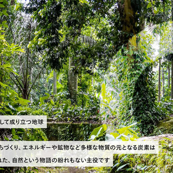
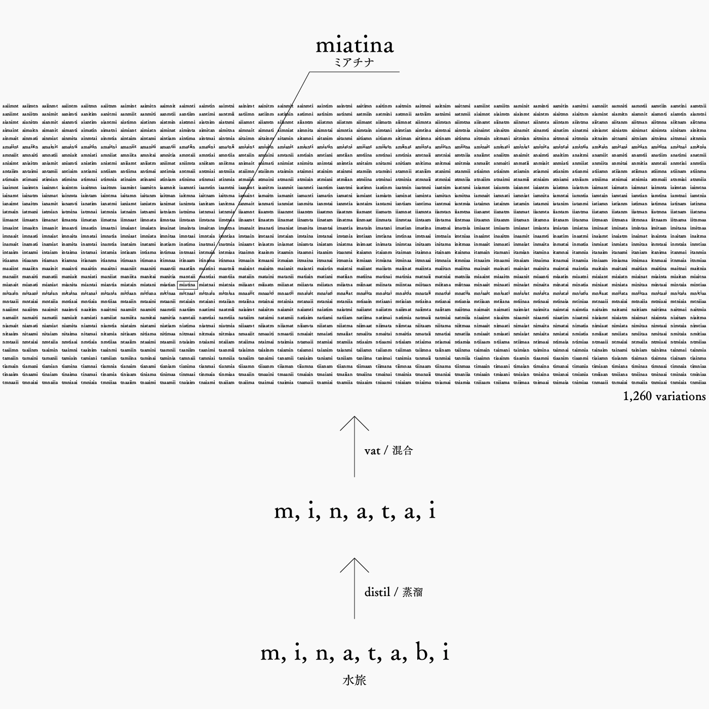
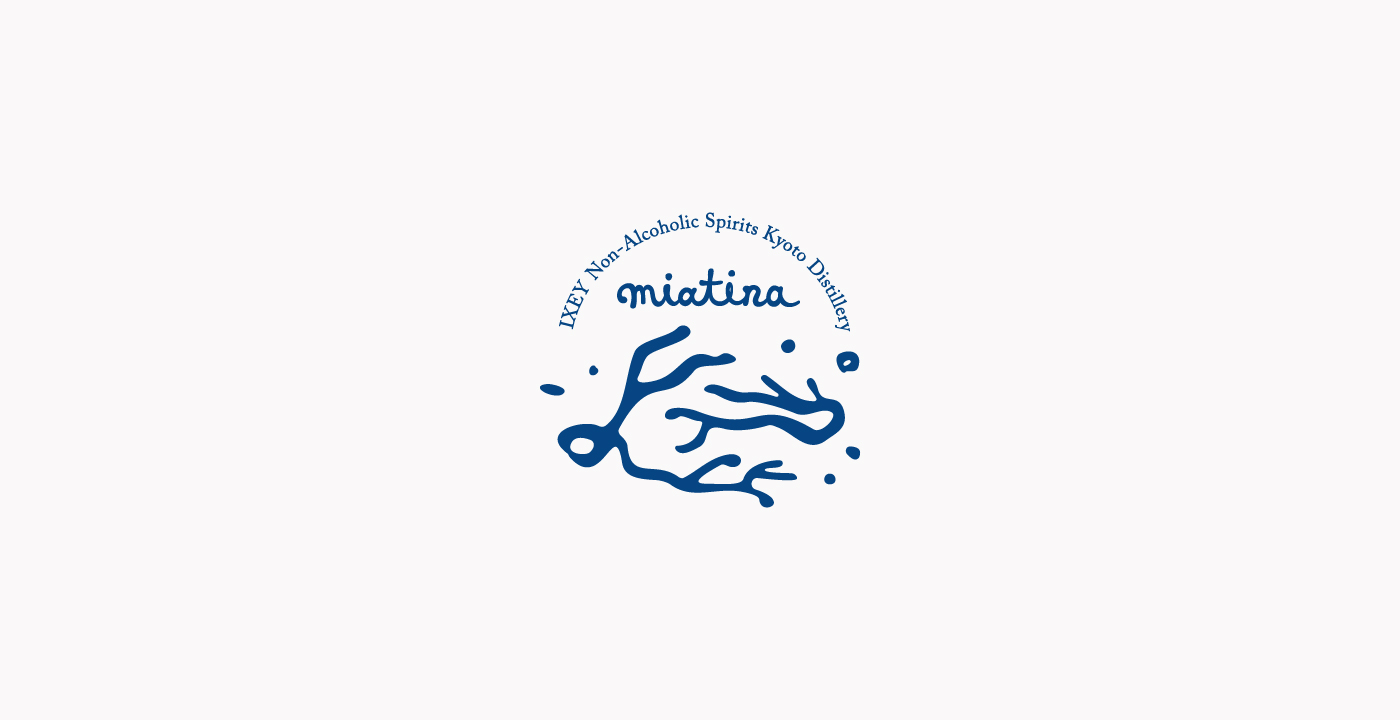
以前より京都大文字山裏の私設薬草園で栽培されたハーブを自ら蒸溜し、時に液体窒素を使用するなど革新的でオリジナリティの高いカクテルを提供してきた織田氏は、自ら蒸溜したノンアルコールスピリッツが与える高揚感のポテンシャルを確信し、「飲む香水」として新たにノンアルコールスピリッツを開発しました。対話を重ねる中で、織田氏が感じる心象風景を追体験できるメディアとなることがこの新しいドリンクの意義であると感じたo-labは「水旅(minatabi)」というコンセプトを提案。さらに、m, i, n, a, t, a, b, iという要素に潜む雑味「b」を蒸溜にて取り除き、バーテンダー織田氏によるブレンドにより生み出される文字の並び1,260通りの中から、自然・植物が持つ原始的かつ普遍的な魅力が感じられる「miatina(ミアチナ)」という文字列を探し当てました。
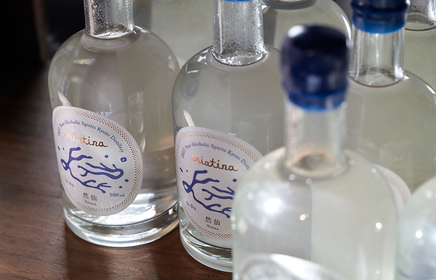
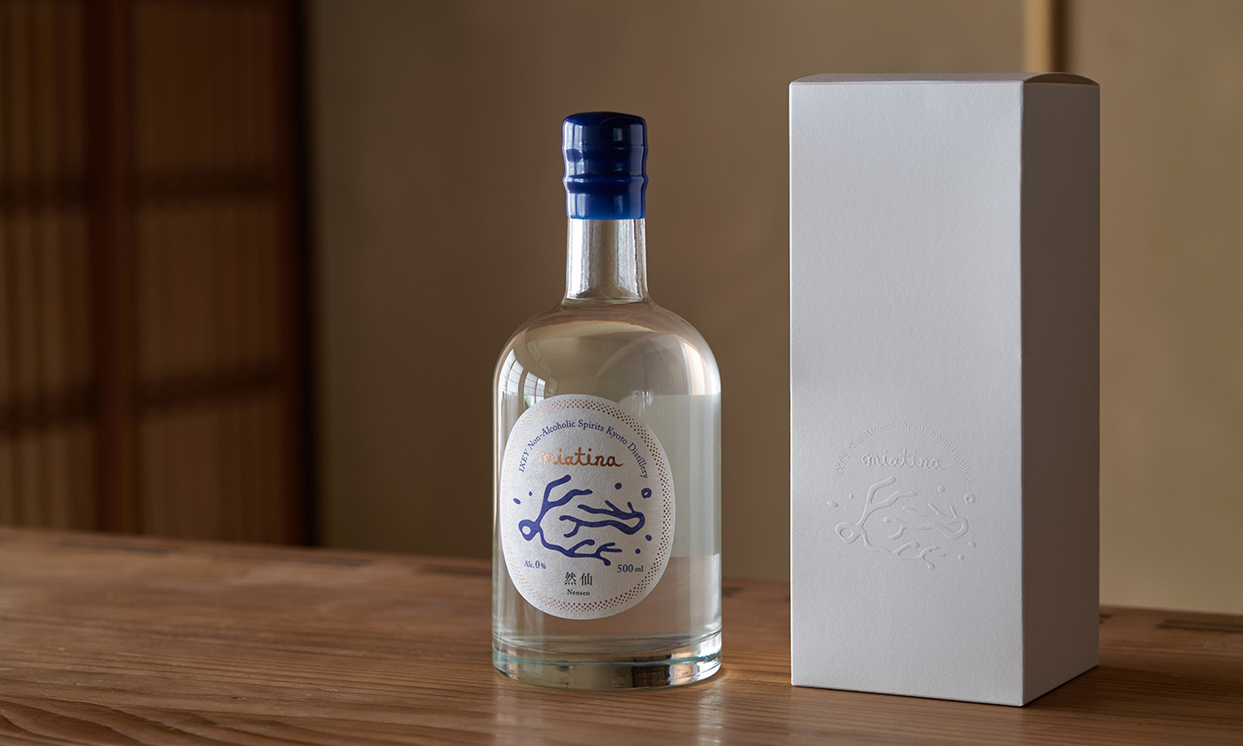
水旅の心象風景、そして植物の有機的かつワンダーな楽しさを表現する絵画のようなロゴマークはボトルキャップを包むワックスと共に水旅ブルーで世界観の軸を形づくり、店舗空間におけるキー素材である銅との親和性の高い箔押しが立体的なコントラストを与えます。
As the so-called sober curious trend grows, Hiroaki Oda, owner and bartender of the bar IXEY in the Gion district of Kyoto, has recently opened a new bar/distillery named IXEY Non-Alcoholic Spirits Kyoto Distillery & Salon in the Gojo Kikuhama area of the city. The store logo, business card design, and the naming, logo, label, and package design of the original non-alcoholic spirits brand produced by this distillery were created by o-lab inc.
A softly-glowing distillery logo on a copper signboard shepherds guests into a welcoming space, set in a renovated 140-year-old Kyoto machiya townhouse. The back of the letterpress-printed business cards and the original paper bags are covered with design represented by 0.3mm dots, secretly embedding two types of QR codes. This captures the unique perspective of Mr. Oda, who seeks to extract hidden value from easily overlooked items, elevating the functionality found therein.
Mr. Oda has been distilling herbs grown in his garden behind Mt. Daimonji in Kyoto and uses these herbs – sometimes combined with liquid nitrogen – in innovative and original cocktails. He has developed a new non-alcoholic spirit, which he describes as ‘drinking perfume.’ In their dialogue, o-lab proposed the concept of minatabi (water journey) as a medium to re-experience the mental landscapes envisioned by Mr. Oda. They further distilled out the ‘b’ from the elements m, i, n, a, t, a, b, i, and from the 1,260 possible combinations of these letters, they came across ‘miatina,’ a word that conveys the primitive and universal charm of nature and plants.
The logo of miatina, resembling an imagined landscape of a water journey and the organic, wondrous joy of plants, describes the world in Minatabi blue, along with the wax seal that envelops the bottle cap. The foil pressing, echoing the copper used as a key material in the store, provides a telling three-dimensional contrast.
Client
幾星|IXEY
Year
2022
Collaboration
Direction: Noboru Konishi (Spring Spring)
Space design: Hiromitsu Konishi (miso)
Photography: Mariko Taya (Qualite Link)