KIKOE
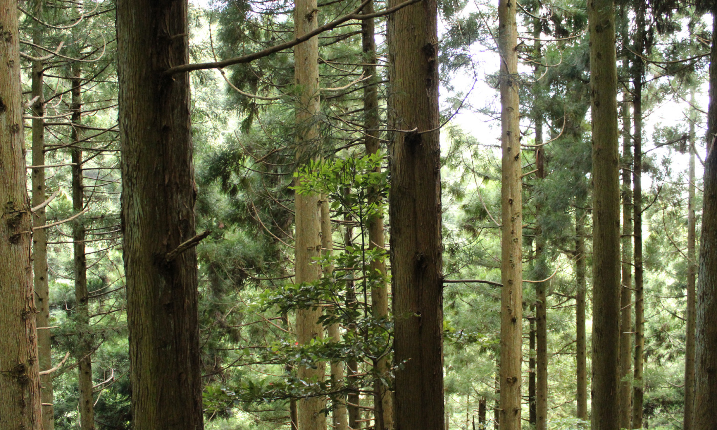
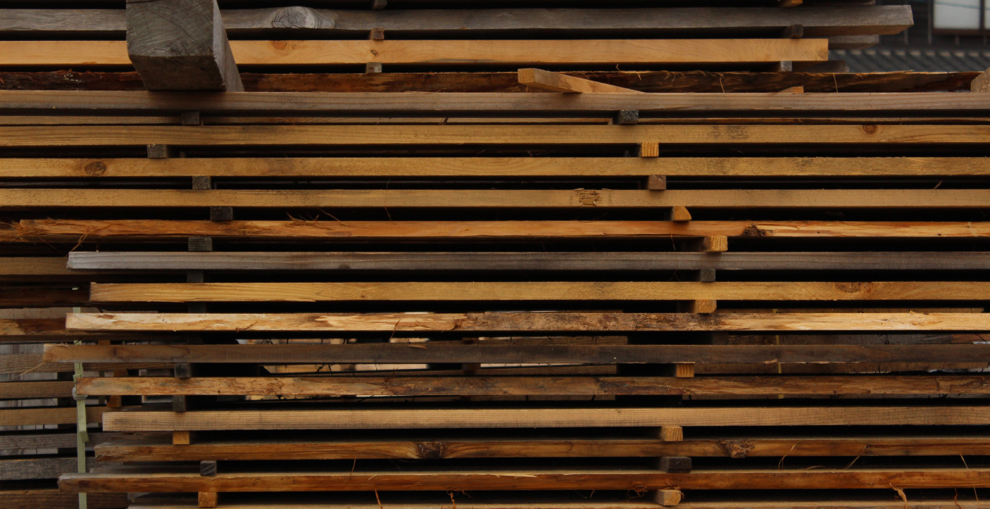
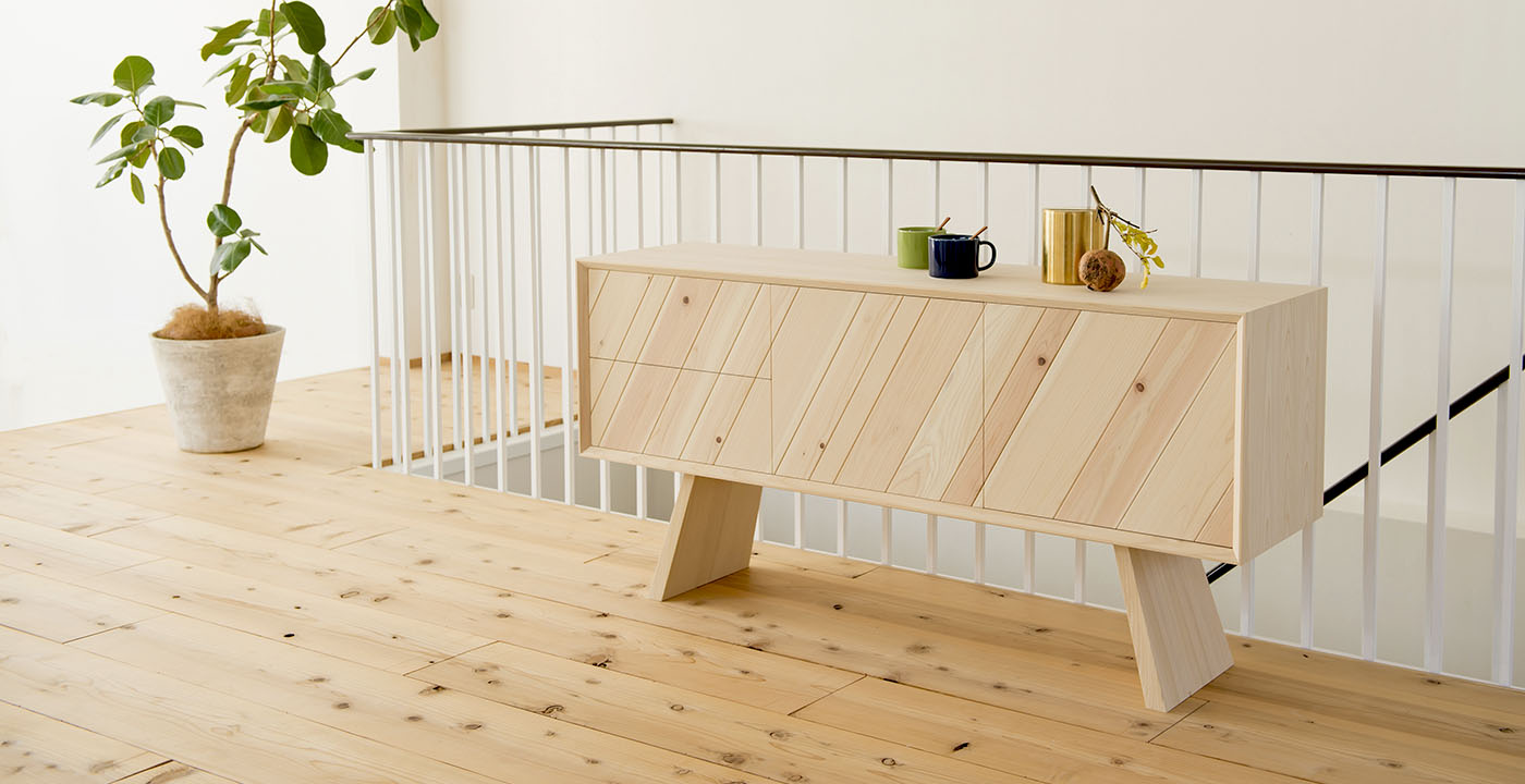
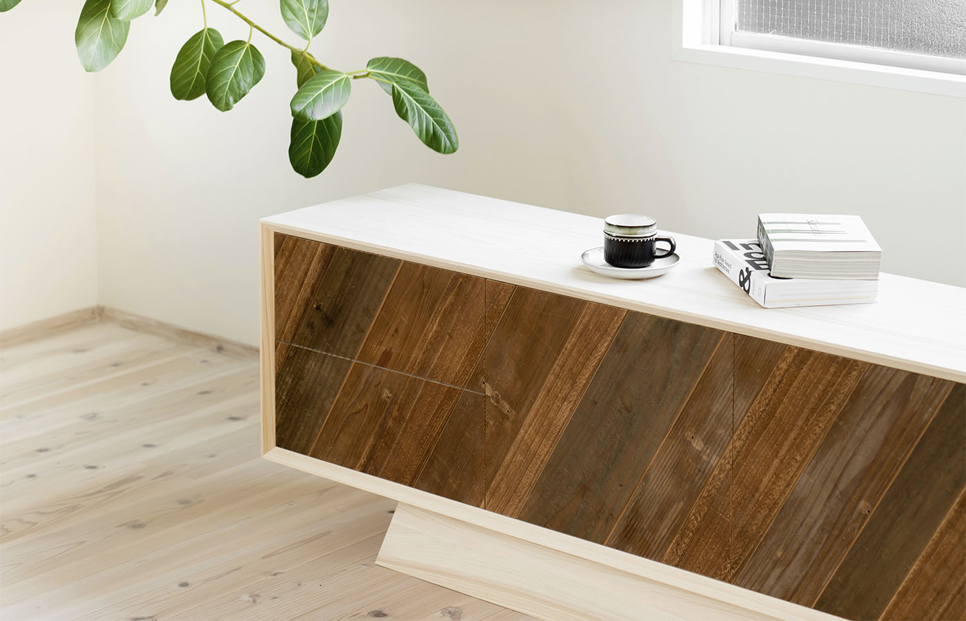
国土の3分の2という森林に恵まれながら輸入木材の使用が逆に6割以上を占めてしまっている日本の現状、そして私たちの身の回りにある木々の存在を感じられる暮らしを提案したいとの思いが新しいブランド構想の始まりでした。とはいえ、スギやヒノキなどの国産材を使用した家具はともすれば伝統的な和テイストになりがちで、現在の日本におけるライフスタイルとの調和が大きな課題でした。しかし、これらの木材と正面から向き合ってみると、家具には不向きと考えられてきた針葉樹の柔らかさはそれだけ触覚に訴えかけること、傷の付きやすさは経年変化の一部として愉しめるであろうこと、無塗装の桧材は忘れかけていた癒しの芳香を持つことなど、過度な工業化と合理化が進んだ今日においては逆に新鮮に感じられるさまざまな魅力で溢れていました。ロゴマークは、木の年輪が暮らしの空間である長方形に馴染んでいくさまを。木の声が聴こえる暮らしを提案する新しいブランドKIKOEの最初のコレクションは、株式会社溝川が得意とする建具・オーダー家具づくりの職人技術を活かした、潔い形状のフレームの中に陽射しを思わせる天然の絵画のような無垢材鏡板が覗く、従来の国産材家具にはない新鮮な箱物家具シリーズとなりました。古家具の一部を新しいフレームに組み込むハイブリッドな家具など、文化的にもサステイナブルな提案です。
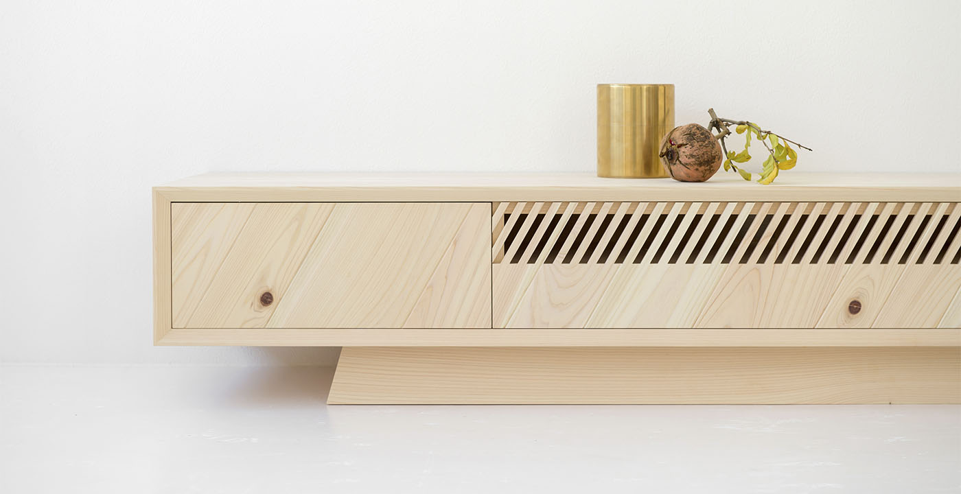
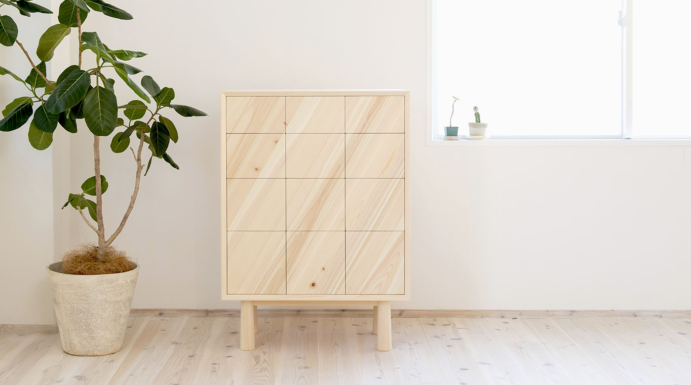
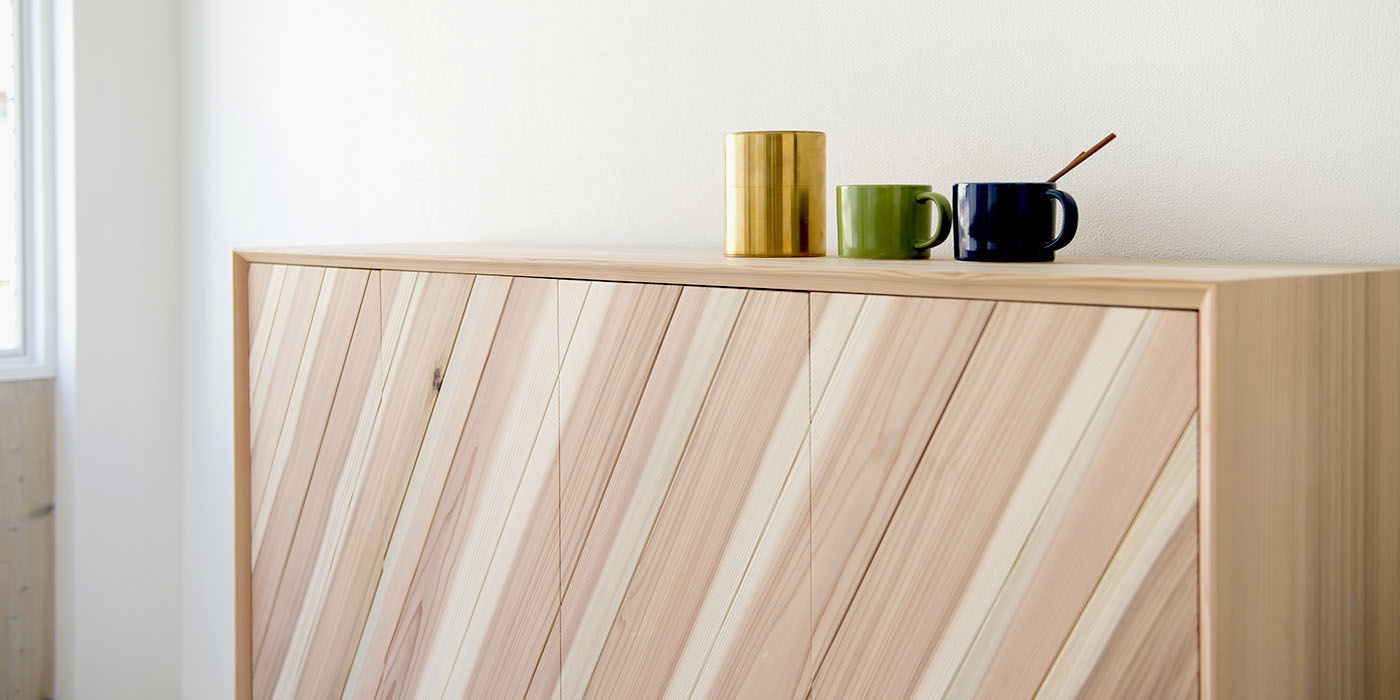
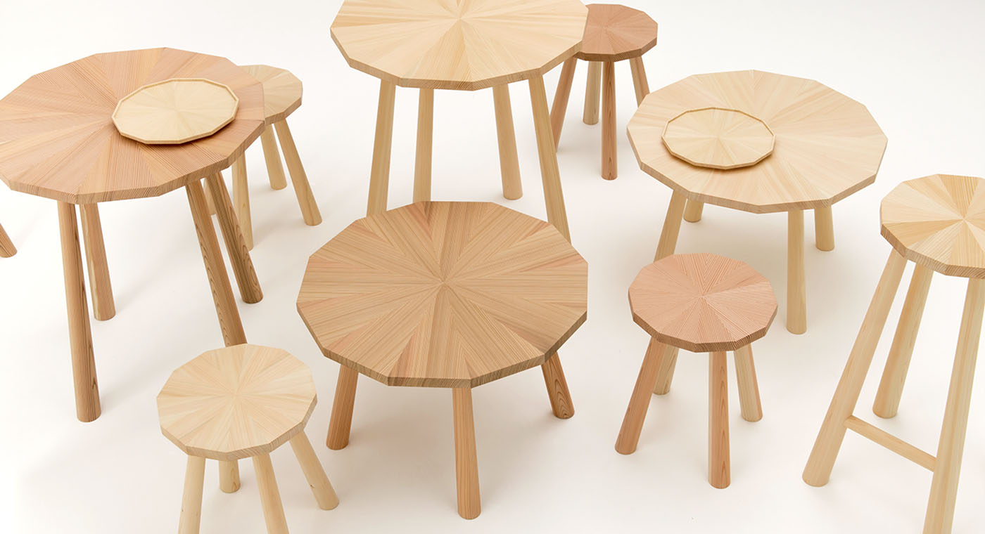
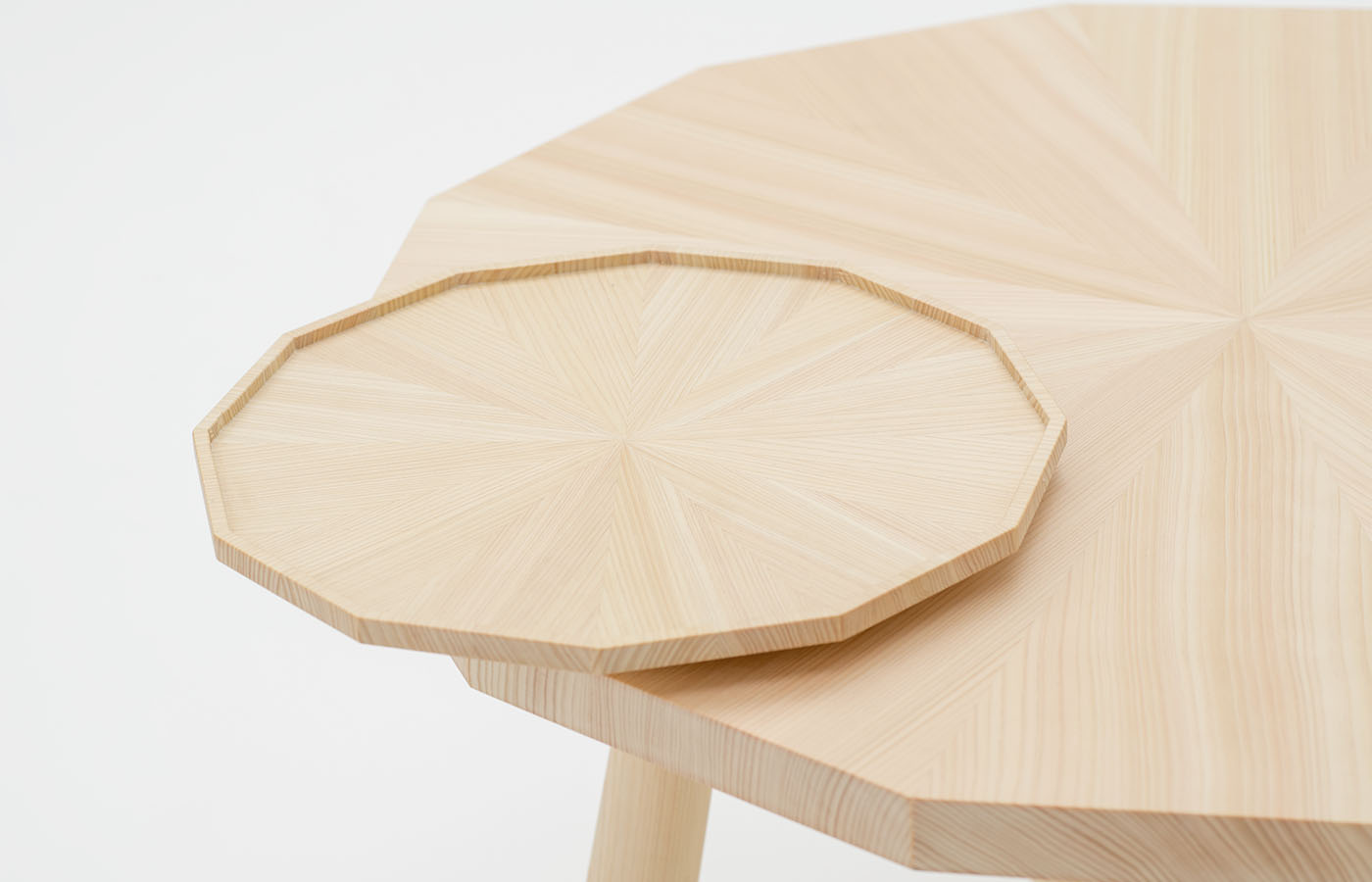
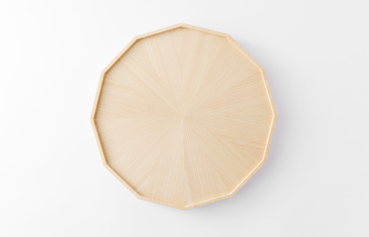
第2期シリーズでは、高い木工技術により放射状に接ぎ合わされたスギやヒノキの杢目が無二の印象。自然が作り出す有機的なストライプが都会的な幾何学形状の中で不思議な魅力を放つ、国産木材の新しい可能性を感じさせる放射状に脚物家具・日用品が生まれました。
Two-thirds of Japan’s land area consists of forests and woodland. Despite that, more than 60% of the lumber used in Japan is imported. We wanted to seize this opportunity to create a new brand that would spark awareness and appreciation of the timber and trees that surround us in Japan. That said, we are working in a market which – due to the widespread tradition of making furniture from domestic lumber such as hinoki (cypress) and sugi (cedar) – made it difficult to harmonize this approach with current, modern Japanese lifestyles. However, if we only look at the qualities of the wood itself, it became apparent to us that conifer timbers – which are often considered as inappropriate for furniture use due to its softness – is actually very pleasant to touch for that very reason, and through the occasional scratch and dent over time the wood will age gracefully. It is still possible to design and create fresh new items capable of conveying natural wood scents and tactile characteristics – which are now somewhat eye-opening experiences in our present-day rational and industrialized society.
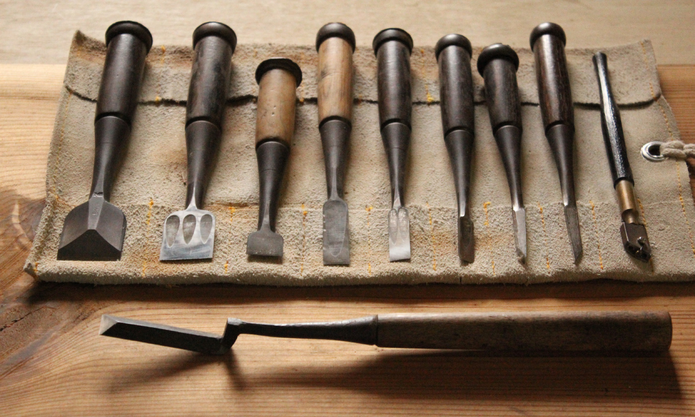
The KIKOE logo is rectangular, signifying a place to live, with the rings signifying the age of the wood. KIKOE literally translates as tree-voice and we wanted people to listen to what the trees had to say. The first collection of furniture and order-made pieces from KIKOE features the experience and skill of the craftsmen at Mizokawa Co., Ltd. An unassuming yet beautiful frame holds pieces of untreated timber that have been arranged to look like shafts of sunlight. A new, fresh approach to furniture design that would have been previously unthinkable in terms of domestic timber. For some items, older pieces have been dismantled and some parts reused to create a type of hybrid furniture – a sustainable approach for the future.
Our second series of KIKOE products uses advanced timber processing technologies to create radial patterns of unrivalled beauty from hinoki (cypress) and sugi (cedar). This urbane, geometrical approach to creating stripes with organic, natural materials is at once a little surprising and yet very attractive. These designs for legged furniture and other daily use items also serve to open up many new possibilities for domestic timber.
Client
溝川|Mizokawa
Year
2016 – now
Awards
Design For Asia (DFA) Bronze Award (2019), Wood Design Award (2015)


