文染|FUMISOME


京都の有力文具店が「伝統文化と現代の文具との関係性を改めて見つめる」という指針と共に設立した株式会社タグステイショナリーは、これまでに「京都らしい色」というテーマで自社インクの開発・販売を行ってきました。歴史的に着物産業が盛んであった室町通界隈に同じく所在する京都草木染研究所をインク開発のパートナーに持つ同社は、ついに天然染料を主成分とするインクの開発に成功。この画期的かつ物語性溢れるインクのデビューをブランド化し、相応しい万年筆と共に世に送り出すというプロジェクトのデザインおよびディレクションをo-labが手がけました。
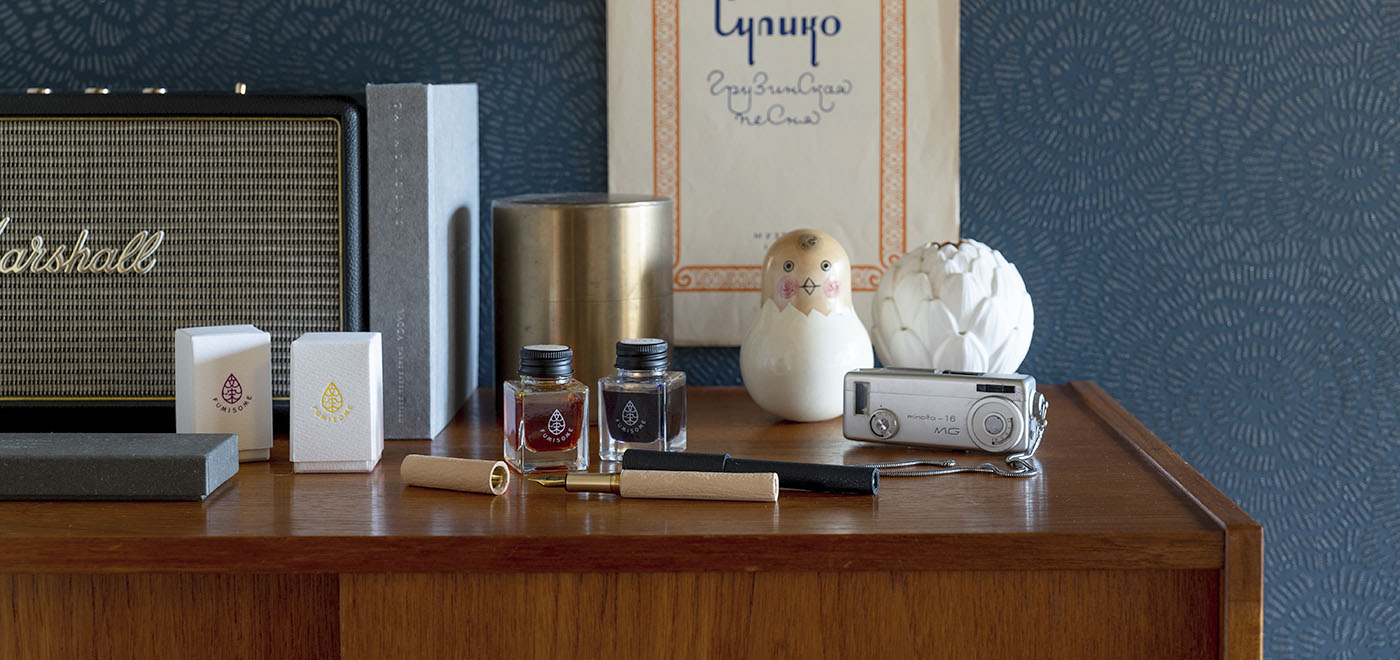
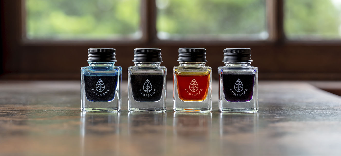
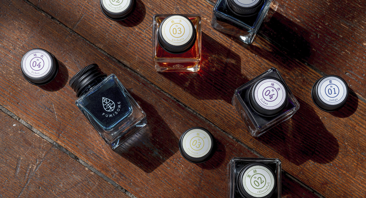
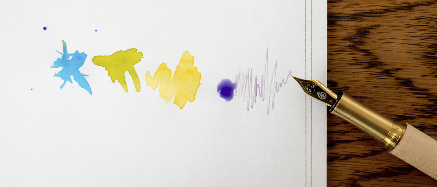
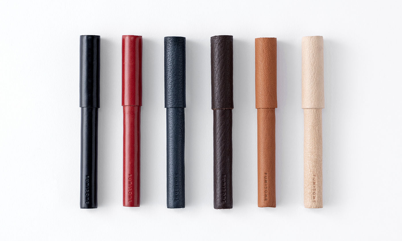
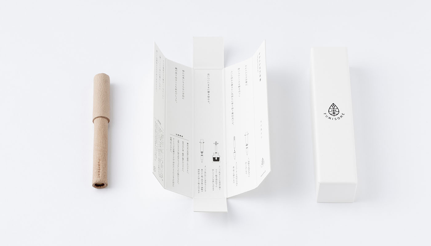
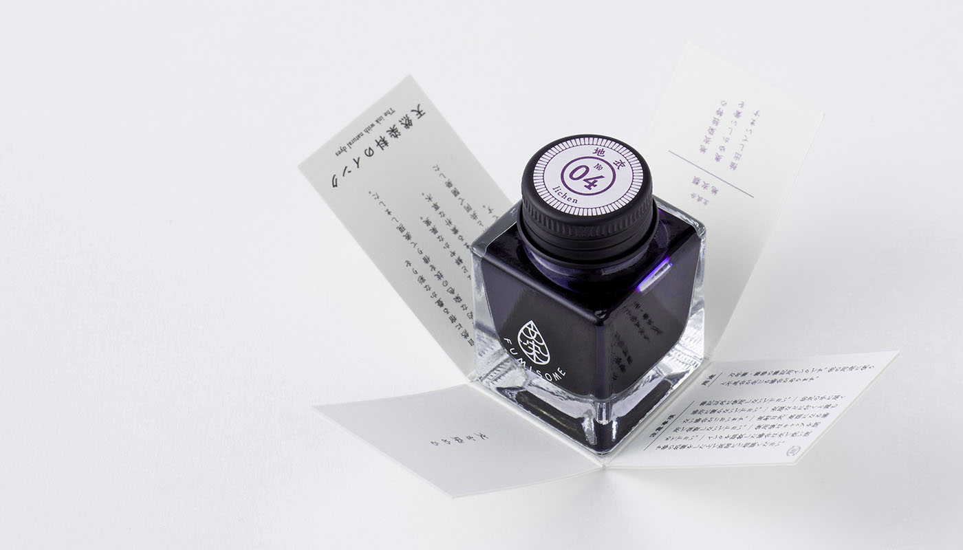
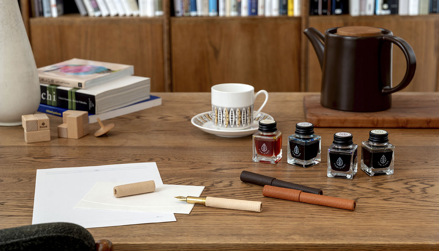
文を染める-をコンセプトに据えるブランド「文染(FUMISOME)」の文字をデフォルメした、植物を象徴する葉や万年筆のペン先、インクの雫などさまざまに見立てられるシンボルマークにブランドの世界観を凝縮し、地衣類や梔子が主成分という情緒性と確固たる科学に裏打ちされた技術性が共存する「ノスタルジックな植物の実験」というテーマの世界観をパッケージやコミュニケーション媒体に確立しました。インクのパッケージには蓋を引き抜くと情報の花が咲く、という仕掛けを実装しました。従来のようにインクラベルをボトル側面に貼付せず、天然染料インクの色自身が最も引き立つ、フルーツジュースのガラス瓶を連想させるデザインを考案しました。男性的な意匠が市場を占める現状の中、万年筆文化のすそ野をもっと広げたいとの思いから、物理的にも感覚的にも「やわらなか万年筆」というコンセプトを創出。通常遮蔽されてしまう革の端部断面はあえて露出させることで天然素材の魅力として昇華させ、精密加工による真鍮性のボディに鹿革または牛革がひと巻きされた、高い職人技術を感じ取ることができるペンが完成しました。
素材にとても素直な、紙を染めるあたらしい道具をお楽しみください。
Founded by one of Kyoto’s most well-established traditional stationers, TAG Stationery was established with the aim of blending the traditional with the modern. TAG was tasked with continuing to develop and sell proprietary “Kyoto-esque” ink colors, and to that end they partnered with the Kyoto Kusakizome Research Center, a traditional kimono dyeing concern located in the same area. This collaboration was a success and they were able at last to formulate natural dye recipes that deliver beautiful color. In order to properly mark this achievement and celebrate the birth of the new brand, TAG Stationery turned to o-lab to help design a fountain pen with which to debut these groundbreaking inks.
At o-lab we started by looking at the characters that make up the brand’s concept – To write letters is to dye paper –, and shaping those characters into the branding strategy. The logo mark depicts the brand name and is reminiscent of a pen nib, a drop of ink and also a leaf – the very symbol of plantlife. There is an emotional aspect to the ink colors being made from natural dyes such as gardenia and lichen. That, combined with the technology behind this innovation was key to communicating the brand theme – that of nostalgia and experimentation. Removing the lid from the packaging of the ink bottle evokes the opening of flower petals, as well as revealing product and brand information. In contrast to the conventional approach, we decided to forego having a label on the side of the ink bottle so that the beauty of the ink color speaks for itself – the way a glass jar of fruit juice does. The physical and aesthetic gentleness of the fountain pen design was based on the concept of spreading fountain pen culture beyond its current scope, and acts as a fresh counterpoint in a market overly dominated by masculine fountain pen designs. The product of skilled craftsmanship features a precisely machined brass body finished with a simple wrap of deer- or cowskin, in which the leather edging is unconventionally left exposed so that one is able to appreciate the natural material as is.
There is honesty in these materials; FUMISOME inks and pens are a new and engaging way to write and draw on paper.
go to : 文染|FUMISOME Design gallery
Client
タグステイショナリー|TAG STATIONERY
Year
2018
Awards
Design For Asia (DFA) Bronze Award (2019), Design Intelligence Award (DIA) Honorable Mention (2019)