Teyney

今日の合理的でデジタルな社会はとても便利な反面、多くのことがあまりにも簡単になり過ぎ、味気なくなってしまった…。そう感じていた京都の町工場、協和精工株式会社は、暮らしを豊かにするためにものづくりの技術を生かしたい、との思いに駆り立てられました。共感し、協働を開始したo-labはその思いをさらに深堀りし、「丁寧なものづくり」「丁寧な人と人のつながりや時間の過ごし方」をあたらしいプロダクトブランドの両軸として打ち立て、独自の世界観を構築していきました。ブランドロゴマークには、解けてしまったものごとをほんの少し結び直せるように、という思いが込められています。
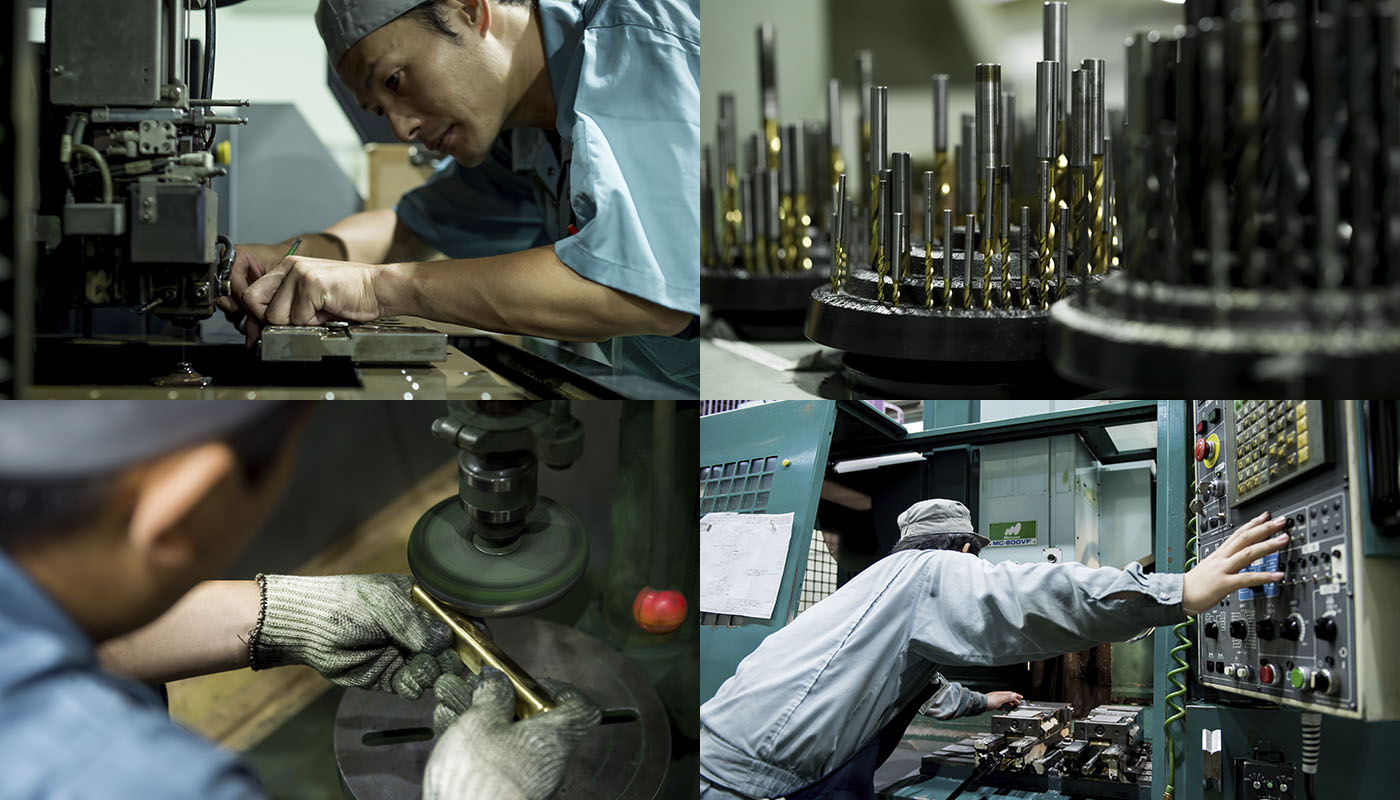
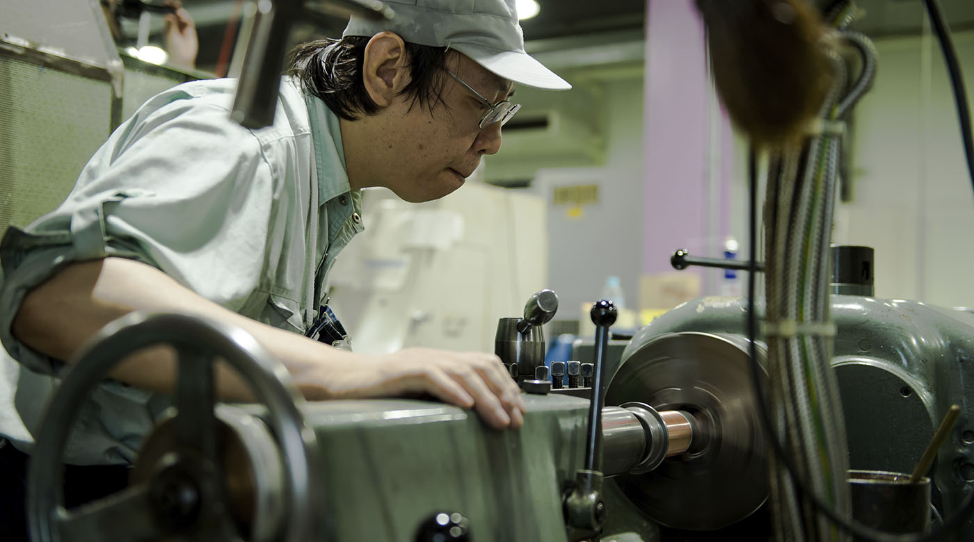
産業装置や医療機器等、高い精度と品質が要求される分野で真摯にものを作り続け、獲得してきた精密金属加工の技術力。多様な機械を自らの意思と身体の延長として操ることができる「工場職人」によるあくなき創意工夫。そして従来の町工場の枠に留まらない、製品を通じて人々の暮らしぶりと対話する情熱。これら作り手のDNAがしっかりと息づくものを目指した試行錯誤の末、機械加工業界では敬遠されがちな経年変化すらも積極的に愉しめる、工業と工芸の間に境界線を感じさせないプロダクトが誕生しました。
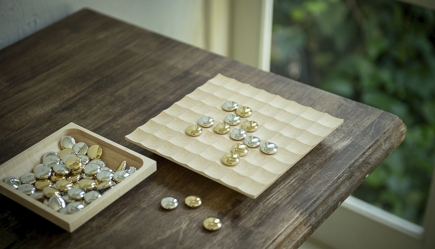
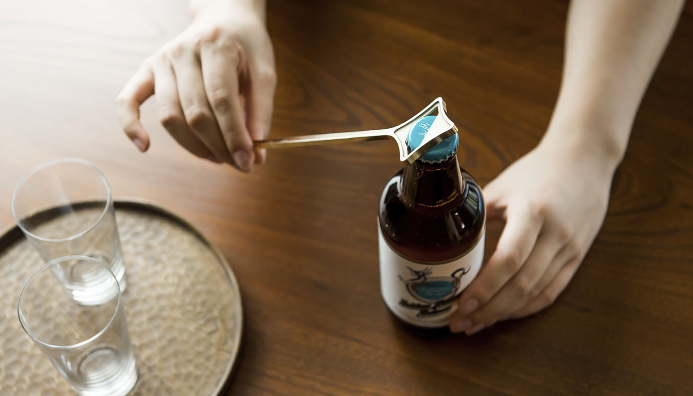
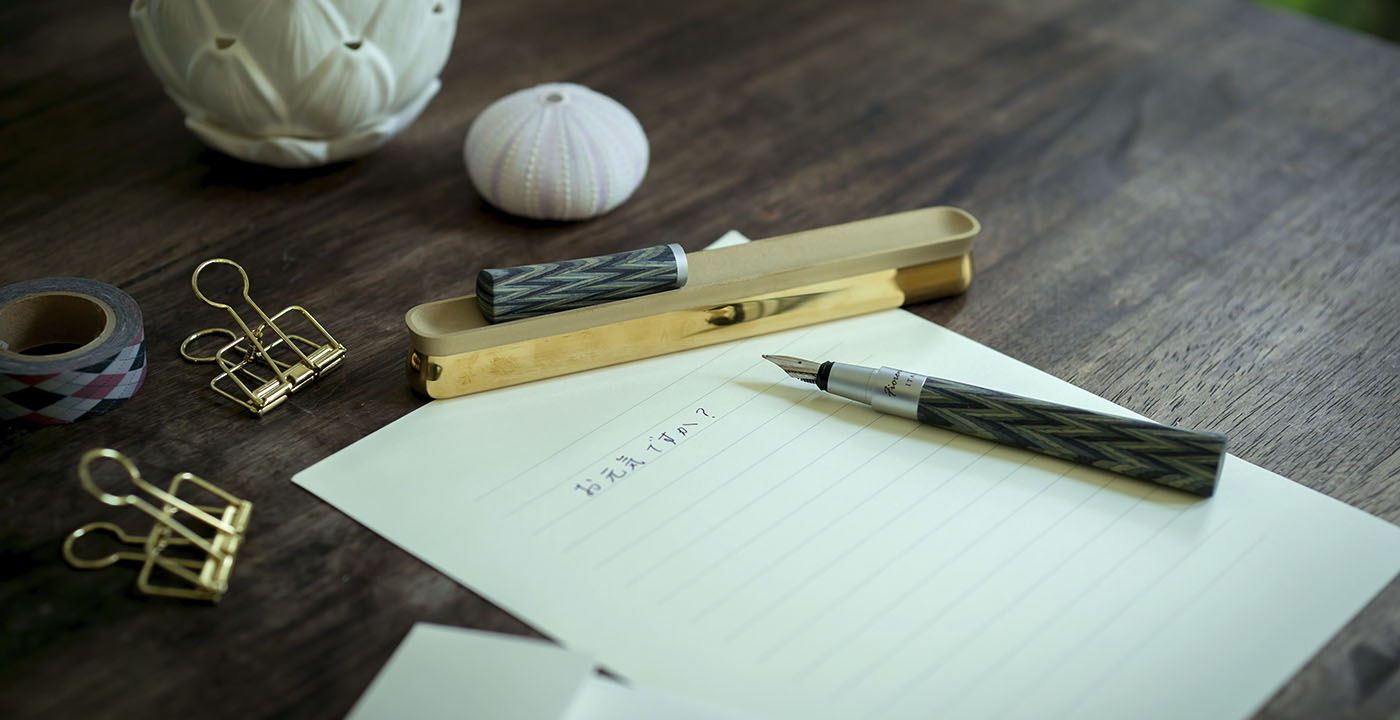
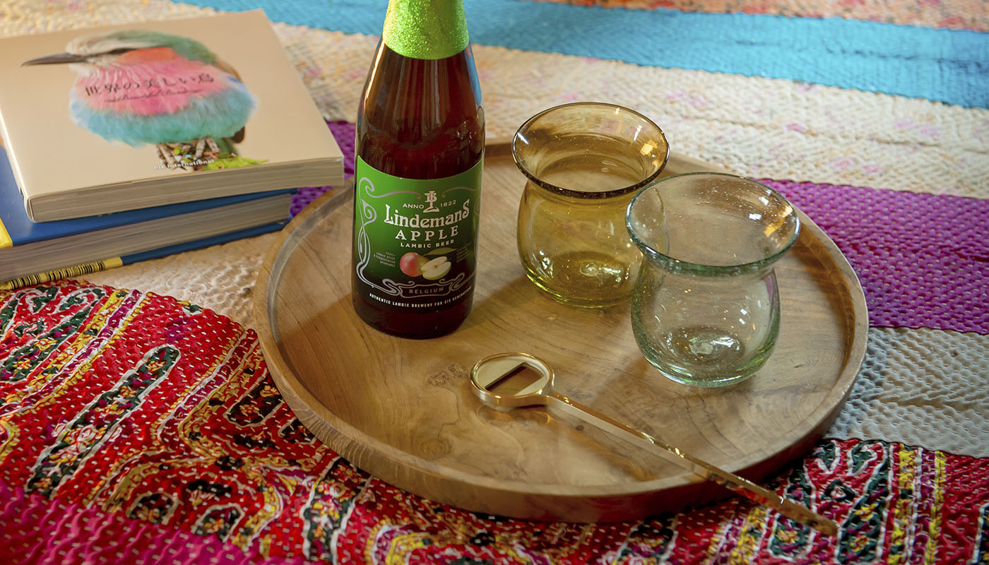
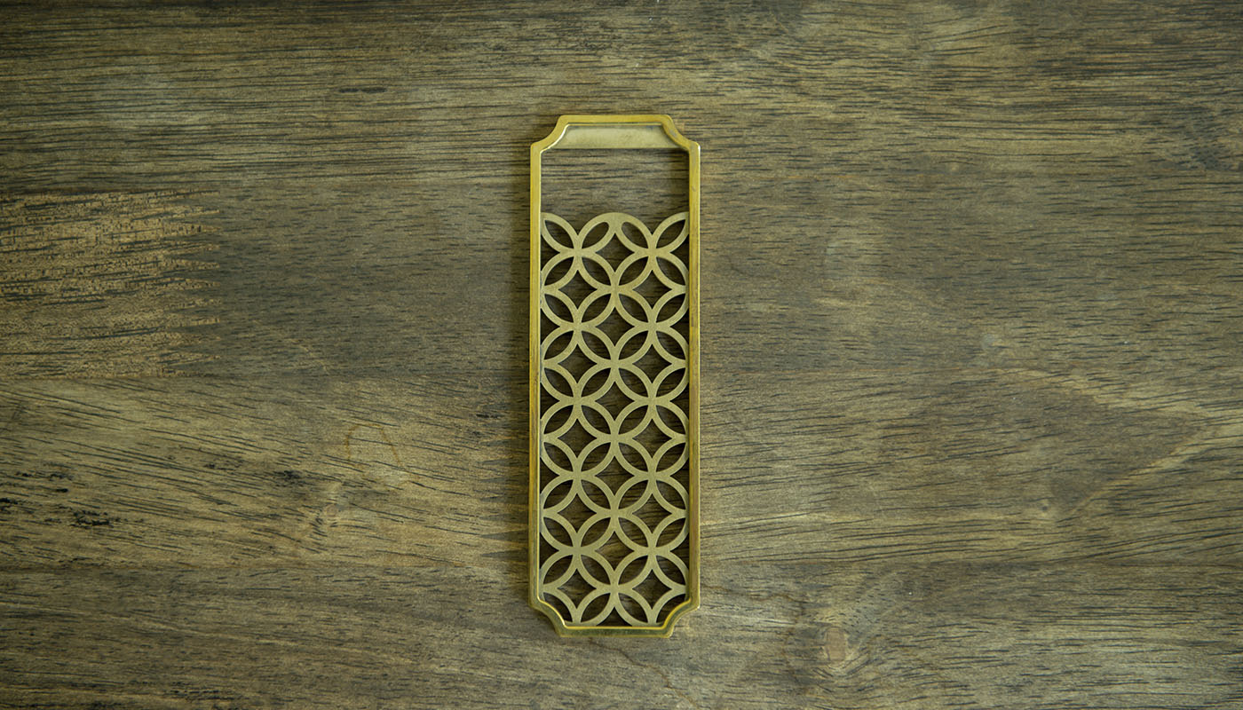
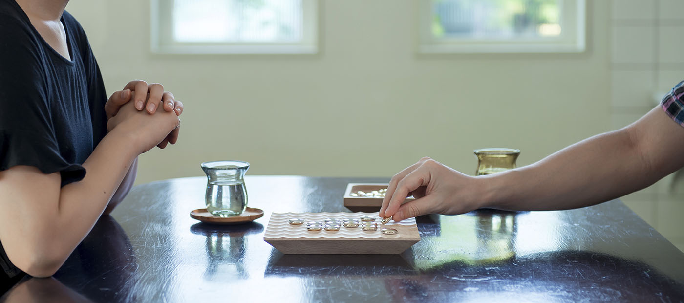
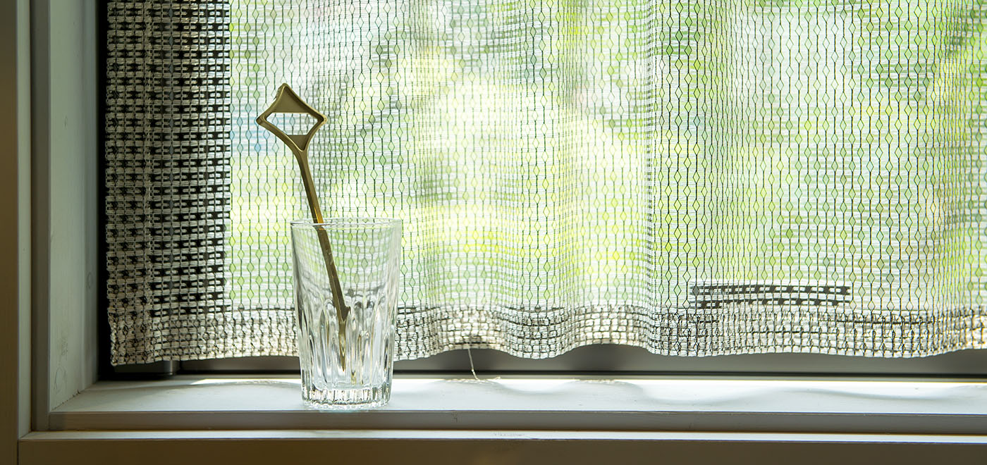
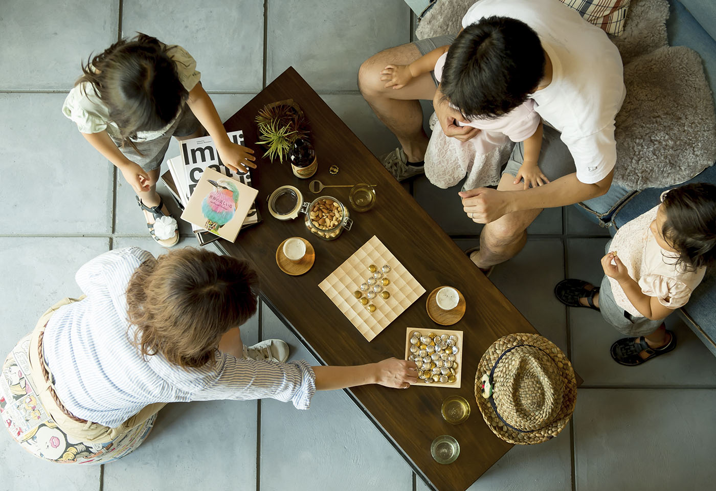
無垢の真鍮とアルミがシームレスに繋ぎ合わさったコマが立体的な盤面上で宝石のようにきらめく、インテリアとしての存在感も放つリバーシゲームは、一つのトレーを共有することでプレイヤー同士のコミュニケーションも深まります。精緻な七宝柄が丁寧なおもてなしを生む栓抜き、魔法の杖やキャンディーのような愛嬌と繊細さが共存する栓抜き、お気に入りの筆記具が乗せられる、手紙を書きたくなるようなペーパーウェイトなど、物語性があり使い手に愛着を感じてもらえるようなデザインがブランドのアイデンティティーとなっています。
Today’s rational, digital world is so convenient – in fact many things have become a little too simple, almost bland and meaningless. The team at Kyouwa Precision Co. Ltd., a Kyoto-based workshop – felt this way and wanted to harness their skills to connect with people. This made the team at o-lab realize the need to create things with meaning – and a new brand – Teyney – began to take shape based on two pillars: the need to make items with care, the importance of connecting with people and time. These values are expressed as teinei in Japanese – and the unique world view of Teyney grew from there. The brand logo signifies an idea – like a thread untied – that has been retied with care.
Kyouwa Precision were able – after much trial and error – to bridge the gap between industrial and artisanal production. What we can refer to as their “DNA” has three strands: their skills in precision metal machining and their ceaseless pursuit of perfection that they have developed over time. The second is the focus and ingenuity they bring to the job – wherein the equipment becomes an extension of the operators own body. And the third strand is the passion of these ‘machinery artisans’ to use their skills to contribute to people’s daily lives through developing and manufacturing original products.
Reversi tiles made of two seamlessly joined metals – akin to pieces of jewelry – sparkle in contrast with an elegantly carved wooden base. These beautiful pieces of wood and metal would grace any room, in use during a game or just on display as a showpiece. Players share tiles stored in a single tray – an aid to deepen communication through play. Teyney bottle openers are functional yet beautiful – Shippo features a traditional seven-sacred treasure motif. Star brings to mind a magic wand – thin and elegant. Candy sports a whimsical and fun design, redolent of sweet candy. Kinchaku is a reassuringly heavy metallic paperweight with a gentle design that recalls a Japanese drawstring purse. It makes one yearn to handwrite letters to friends and loved ones. The brand identity echoes through the design and the hands-on use of each of these Teyney products.
go to : Teyney Design gallery
Client
協和精工|Kyouwa Precision
Year
2016 – now
Awards
Good Design Award (2019), iF Design Award (2018), Omotenashi Selection Gold Award (2017)